Powering businesses worldwide
YOOFLOW is a global pump manufacturer, which since 2007, has been manufacturing, researching and developing high-quality pumps for diesel engines across the world. Brand’s mission is to make the world’s best diesel engine replacement diesel pumps — ones that are as good as (and in some environments, superior to) the originals.
Brand Design Brand Guidelines Packaging Design
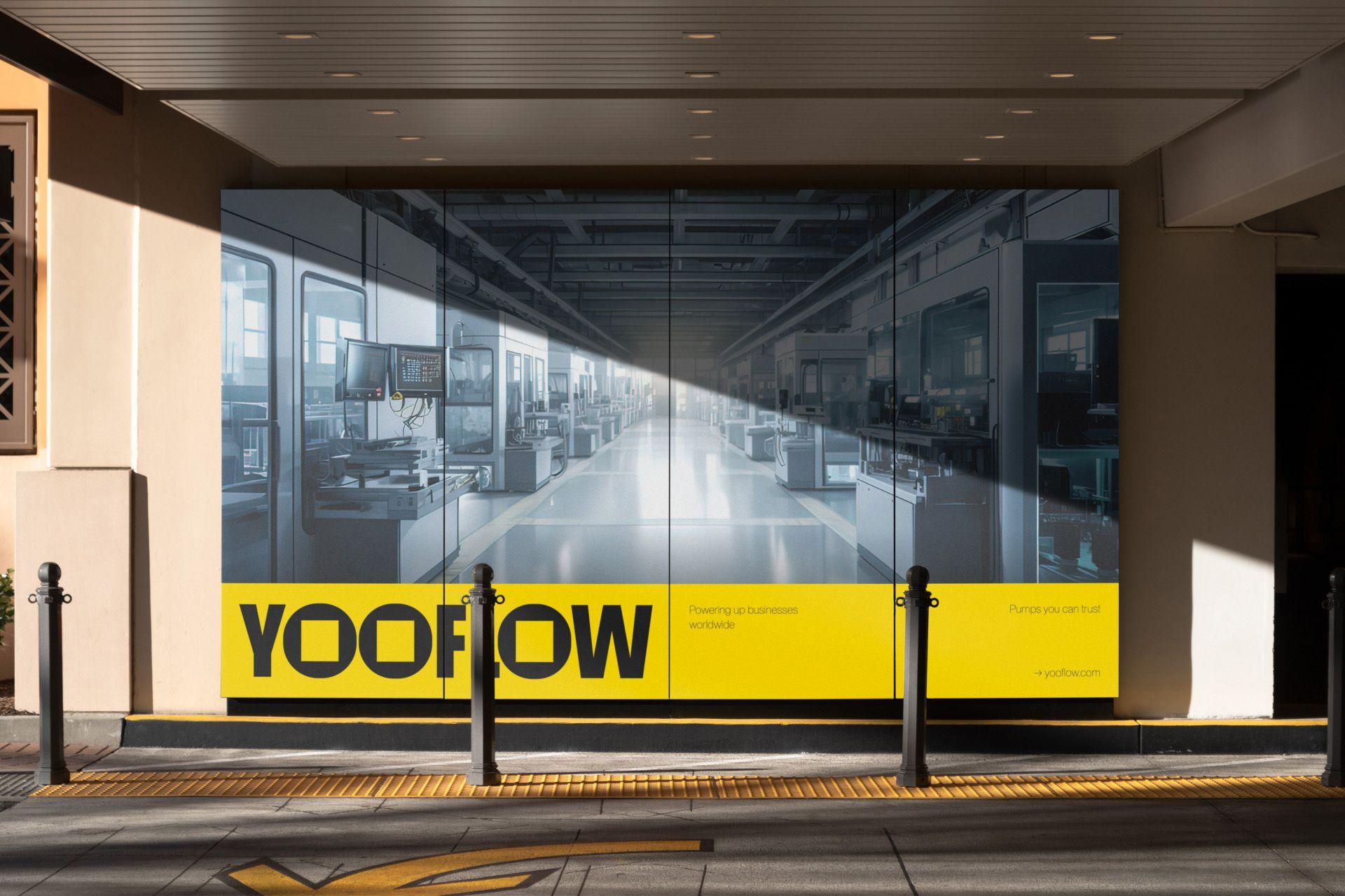
We were commissioned to create a new visual identity for the brand to make it stand out among the competitors and clearly reflect the brand positioning and the business. In addition, we created packaging design as the first step of the brand implementation.
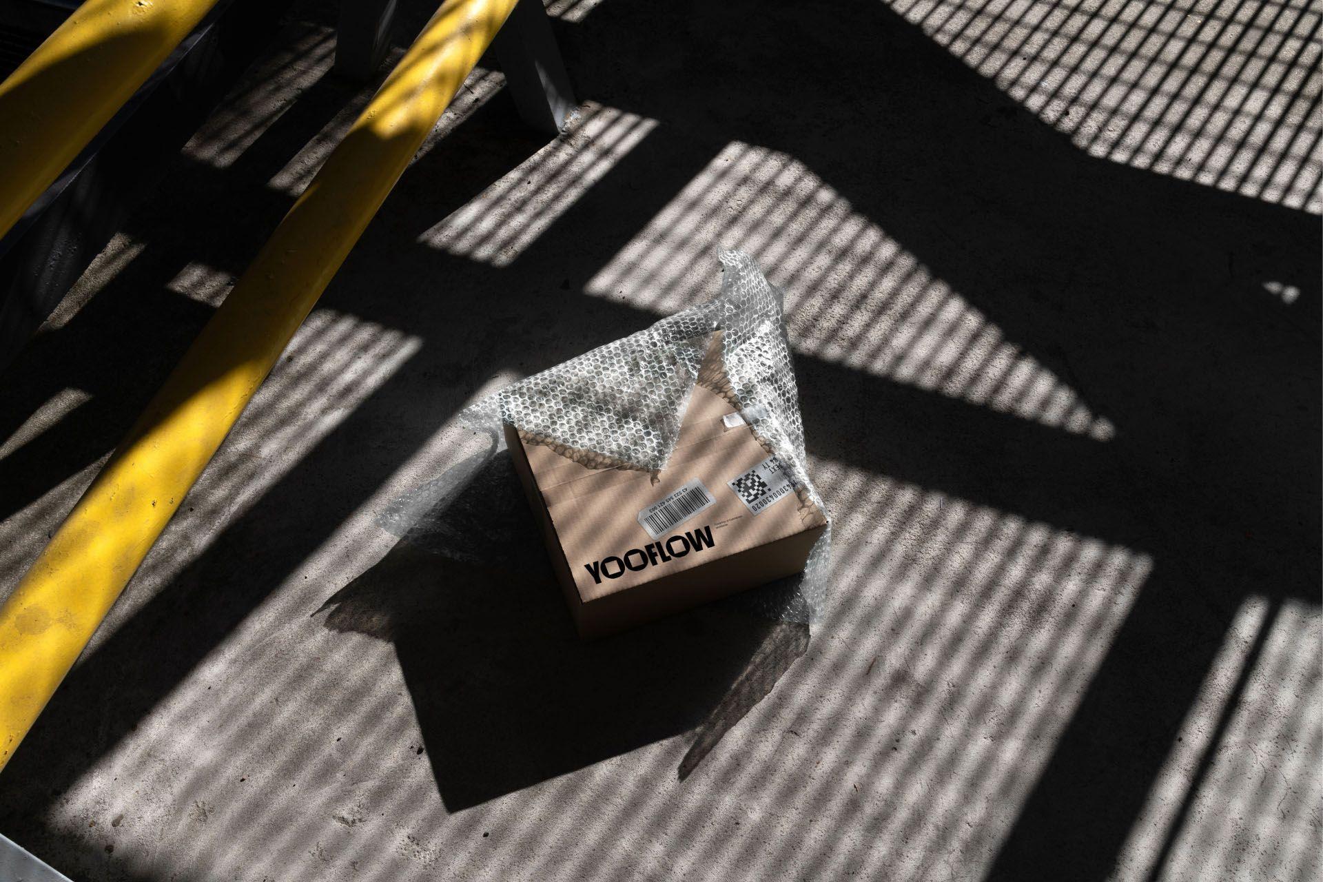
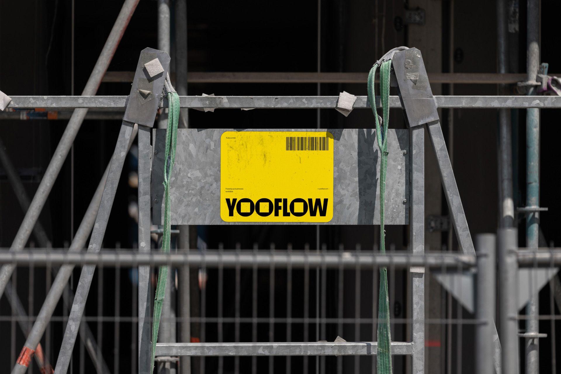
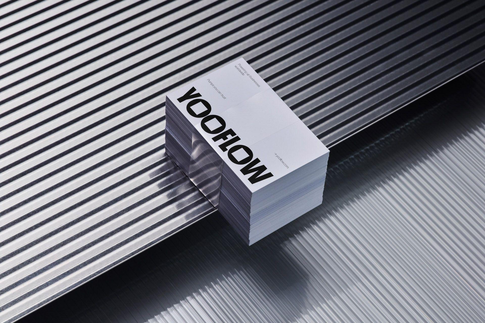
The design concept draws inspiration from the heavy construction machinery industry, encapsulating its raw essence. The logo embodies a robust aura akin to heavy-duty diesel parts, mirroring YOOFLOW's product components for a sense of reliability and strength. The integration of round and square elements symbolizes harmony and balance, highlighting the seamless fusion of diverse machinery components. This aesthetic captures the brand's identity, highlighting consistency but also signifies the coexistence of different parts, perfectly working together.

YOOFLOW’s design concept draws inspiration from the heavy construction machinery industry, encapsulating its raw essence. The logo, a testament to this inspiration, exudes a robust aura reminiscent of heavy-duty diesel parts. Each element is meticulously crafted to mirror the sturdy components of the YOOFLOW’s product, evoking a sense of reliability and strength.
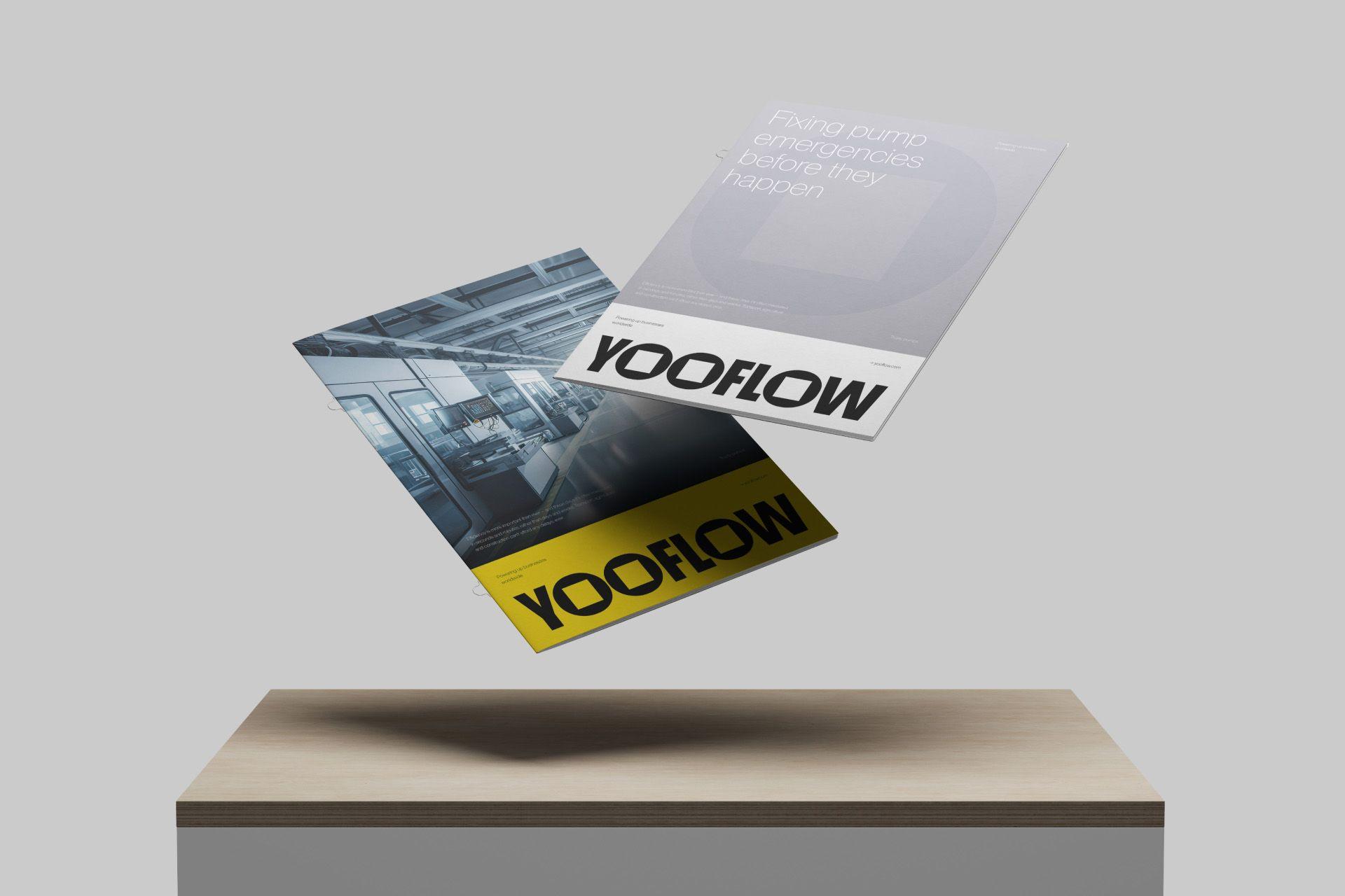
The logo’s aesthetic captures the very soul of the brand, reflecting its core competence and advantage. It stands as a bold emblem, representing a commitment to durability and endurance.
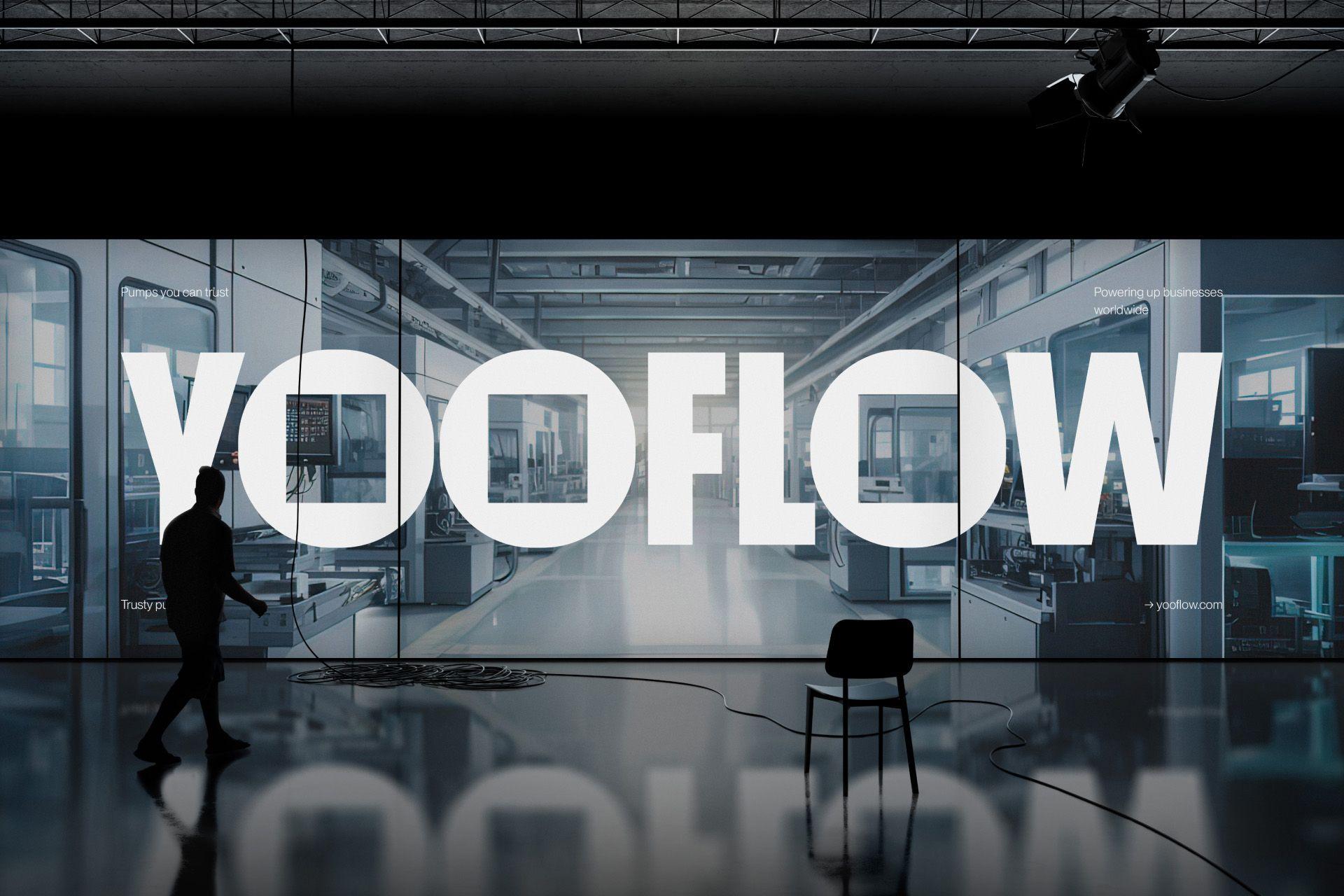
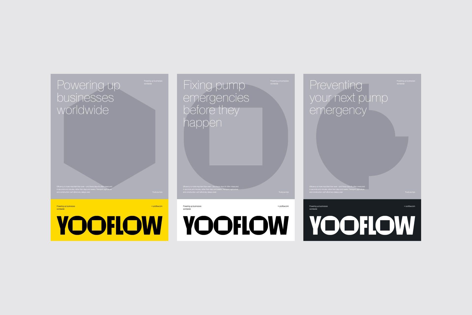
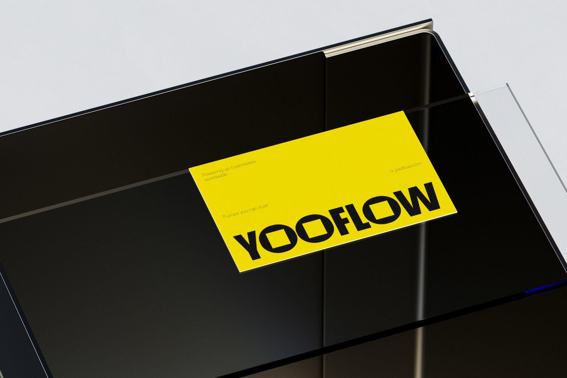
The color palette is a vibrant testament to YOOFLOW's identity. The palette's synergy with the logotype creates a cohesive visual identity, establishing a strong brand presence.
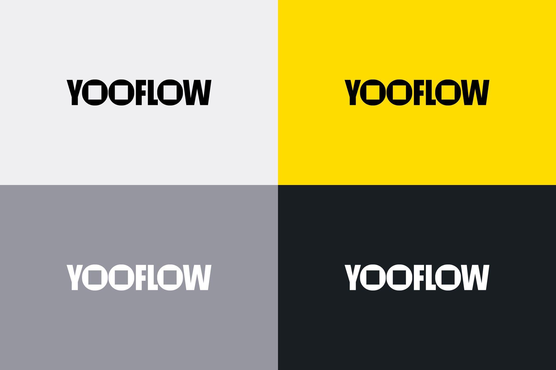
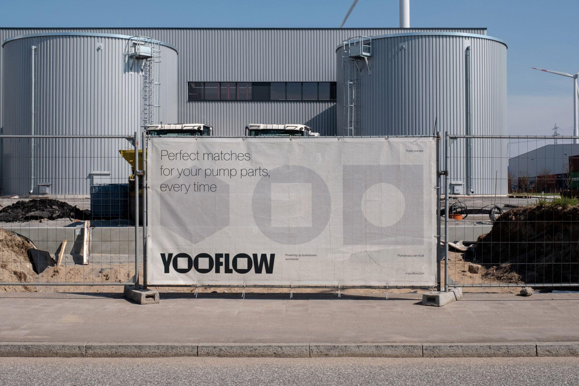
Inspired by diesel engine pump parts, the brand's design element radiates precision and mechanical finesse, embodying expertise and commitment to quality. The integration of both round and square elements symbolizes harmony and balance, showcasing the seamless fusion of diverse components within the machinery. It emphasizes consistency but also signifies the coexistence of different parts, perfectly working together.

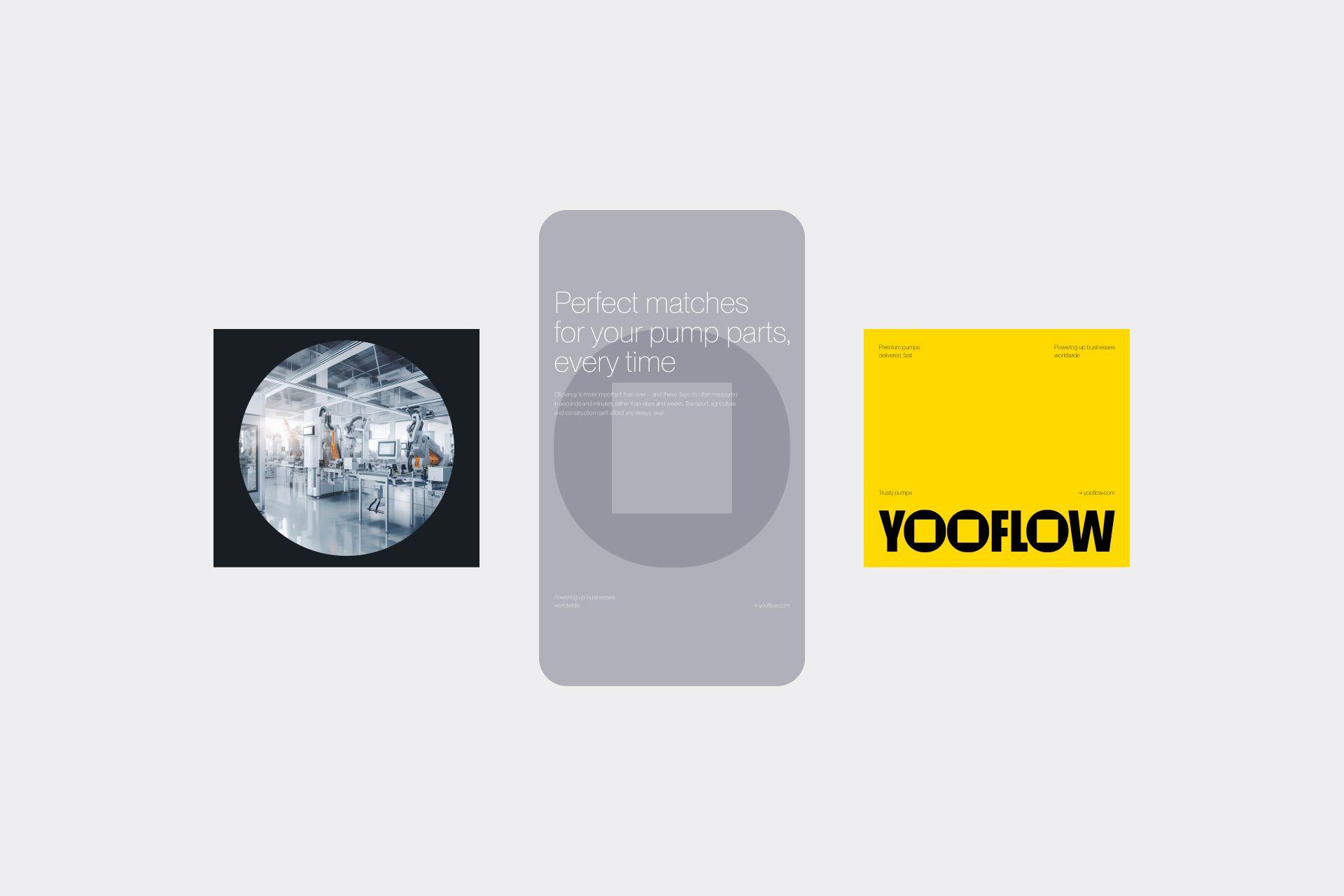
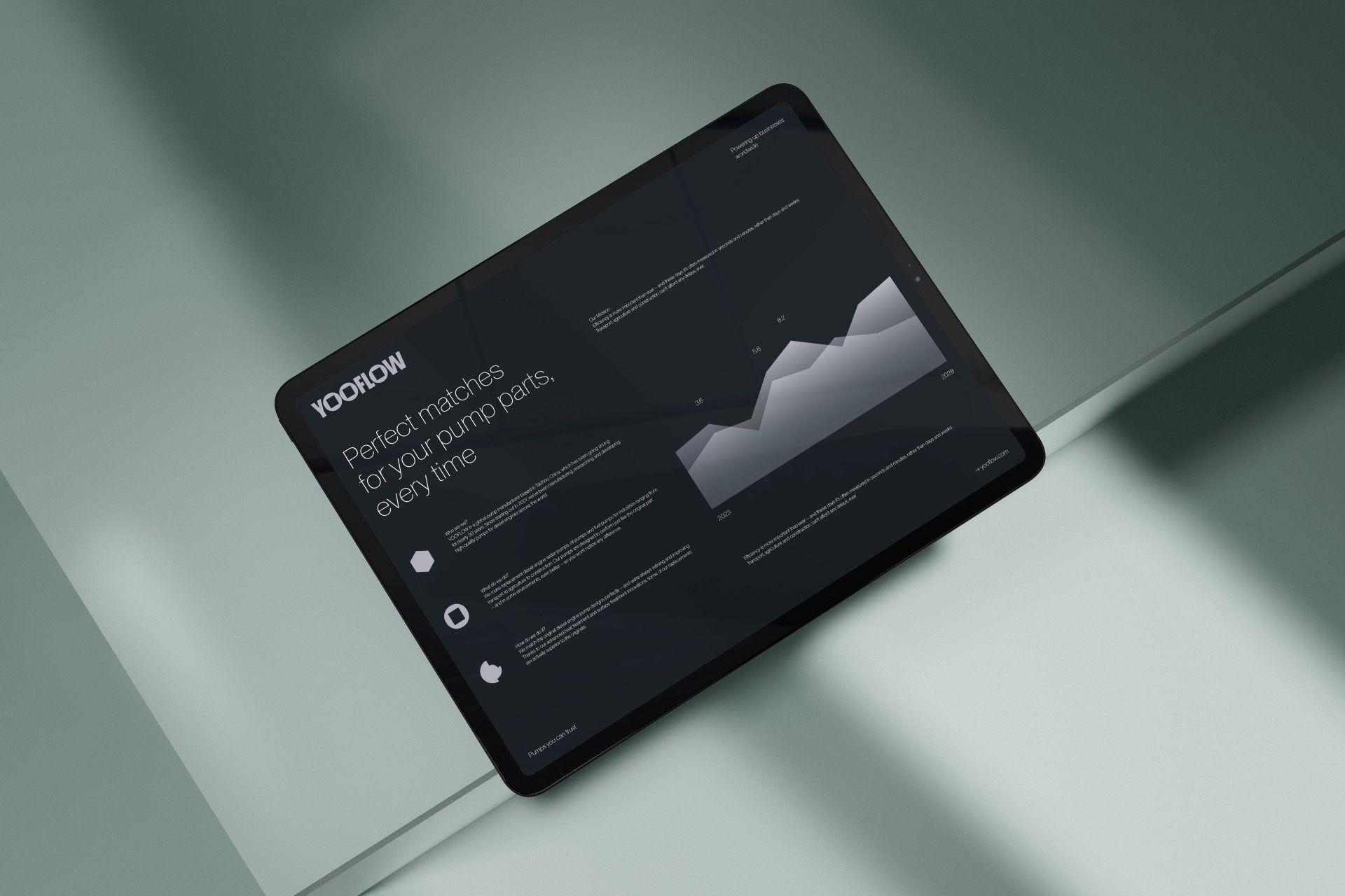
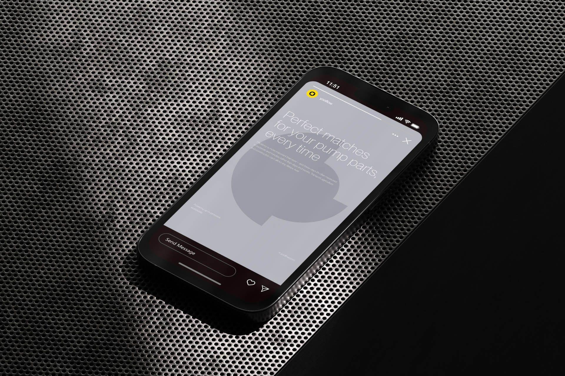
The light and clean layout system seamlessly fuses functionality and aesthetics, applicable to both online and offline materials. Diverse colors and shapes enhance the brand's visual identity.
