
Scientists of the future
Stardust Magazine is an educational resource for young talents. In its pages you will find a variety of articles on any topic. Starting from news in the world of scientific discoveries to texts from the world of sports. The purpose of the magazine is to be a useful and informative resource for young users who are just starting out and are looking for how and where to prove themselves. In addition, the magazine is also important for other audiences, those who have already achieved some success and share their experiences through interviews and articles.
Brand Name Brand Identity Brand Guidelines Website Design
Our team needed to create an image of the new media that would be suitable for young researchers as well as for specialists and professors. The magazine had to be formal, and academic, but at the same time not boring like a textbook.

We came to the conclusion that the magazine should have a formal and solid image, because even the youngest readers are little adults. We complemented the magazine's formal image with colored accent elements, which added a sense of art and creativity to education.

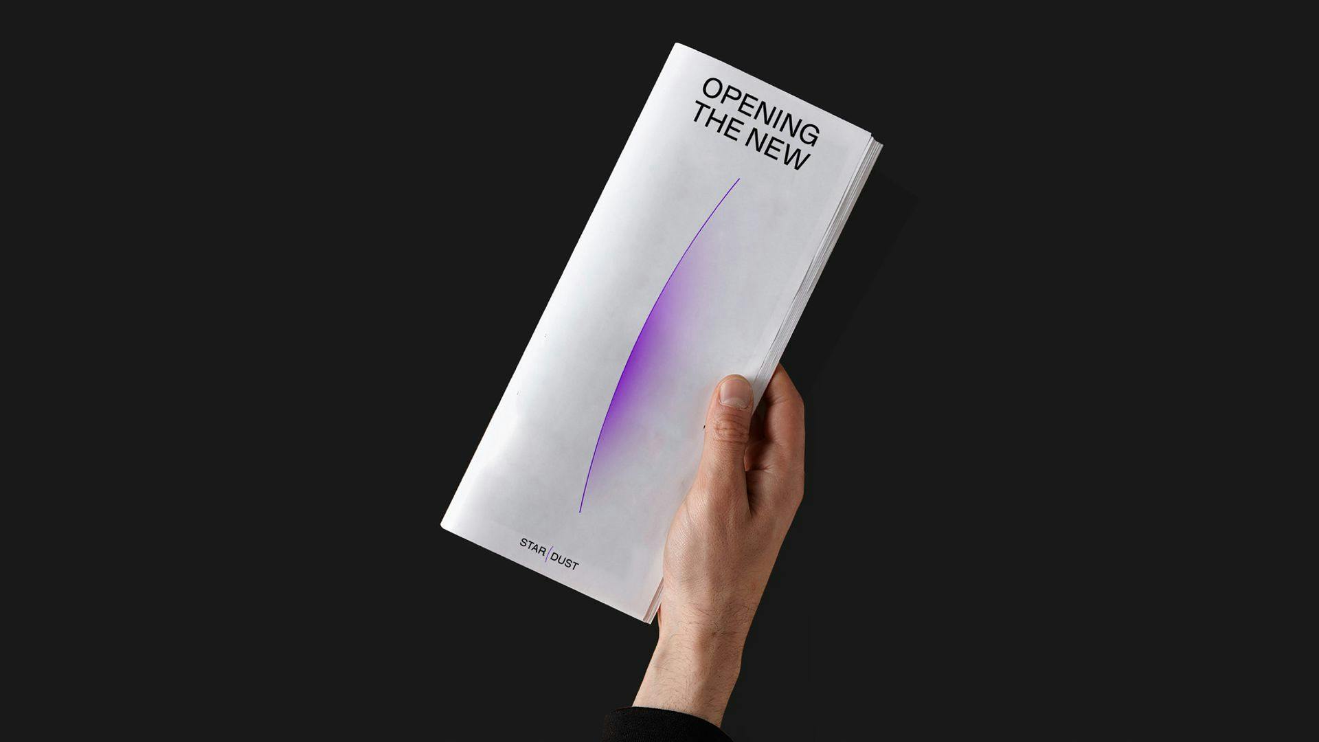
The image of the new brand is restrained and monochrome. The visual language was created for an intellectually mature audience. It is meant for people who have been interested in science since childhood and seriously plan to become great scientists, as well as for those who have already reached that level.


The logo sign resembles star rising and used as a metaphor of an academic rising star. It is a story about energy of leadership, the beginning of the journey, the rising and the first scientific victories.


The color palette is monochrome, complemented only by only one accent color and gradient. This style appeals with its restraint, while the bright accent makes it look creative, modern and eye-catching. There are three different fonts that have been picked up for this brand. They can be used separately depending on the purpose and topic of the message.

The design is based on a plain b&w layout supplemented by bright accent color. This layout system was inspired by the examples of modern scientific publications. The structure of the layout system and the use of fonts in a rarefied format is balanced by the use of bright accent elements and luminous gradients. Focusing on the intersection of science and art, the brand design creates an institutional image for the media.


