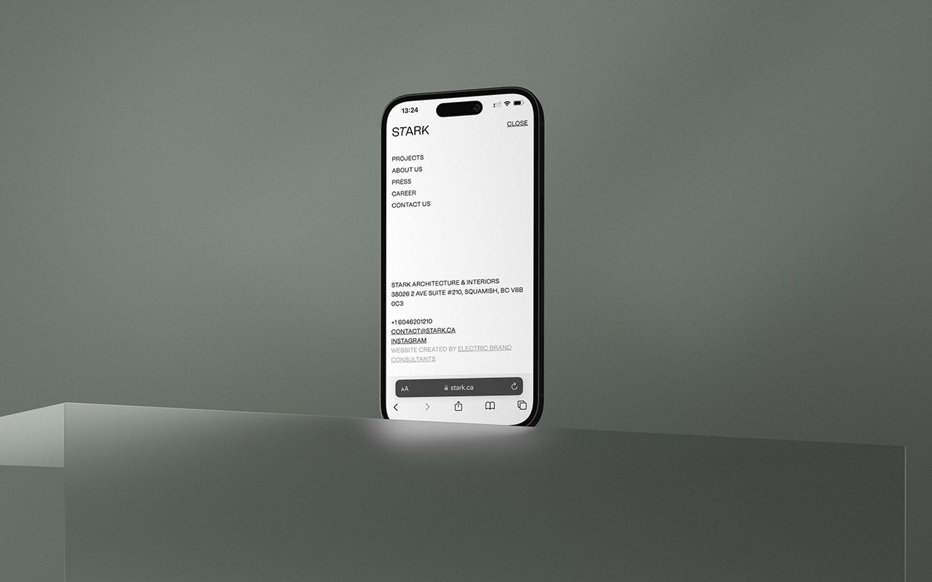
We make architecture together
STARK, an innovative architecture and interior design studio from Canada, decided to redefine its brand identity. The new concept, "The Thrill Seekers," captures brand's passion, sustainability commitment, and collaborative ethos. The refreshed visual identity reflects their core values and invites audiences to experience architecture's sensory journey.
Brand Platform Slogan Brand Identity Brand Guidelines Website Design & Programming Social Media Kit

As a full-service studio, STARK seamlessly integrates architecture and interiors, accompanying clients throughout the entire design and construction journey. Sustainability is paramount, as the team strives to design energy-efficient buildings with minimal ecological footprints, respecting and preserving the surroundings.
In order to reflect expert view and its uniqueness, the new brand must have been created. That's why we collaborated with STARK to create a strong brand idea. During the research we always pay attention to the daily brand communications and look into different examples to find something great that they are best at.
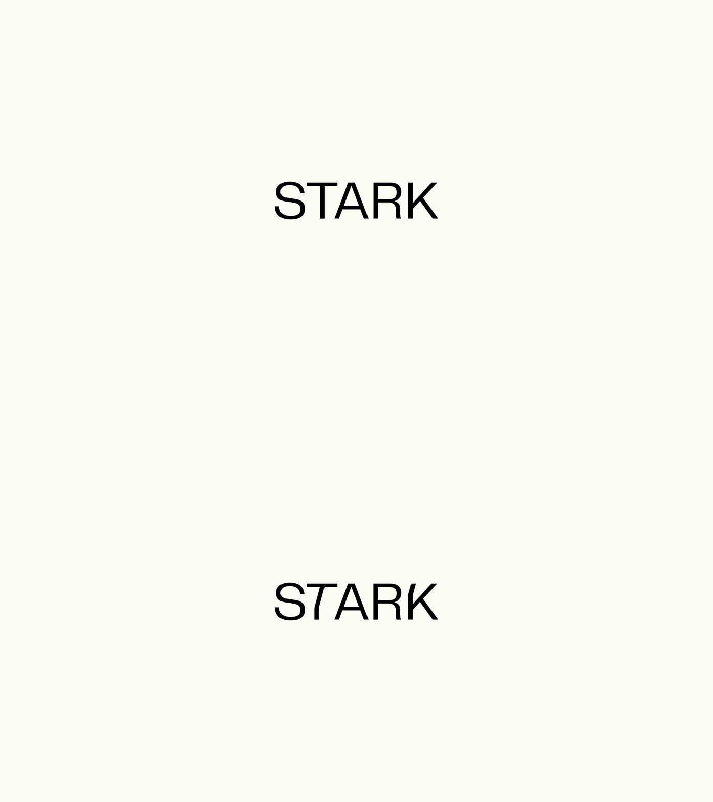
To capture STARK's uniqueness and honor its environment, we conducted market research and a brand audit, shaping a fresh Brand Strategy that celebrates passion for thrilling experiences and drive to conquer nature's peaks. The renewed visual identity blends soft minimalism with nature-inspired architecture, emphasizing sustainability, playful innovation, and clean aesthetics. We've integrated actual house blueprints and textures, forging a tangible link to brand's distinctive approach as well as a serene photography style, reflecting both calmness and the courage to find peace amid chaos.

We delved into market research, trendwatching, and a comprehensive brand audit to formulate STARK's Brand Platform – defining its Mission, Vision, and Values. After conducting the interviews with the STARK team we have decided to propose the brand concept that celebrates the love for thrilling experiences that STARK offers, its sportsmanlike spirit and desire to conquer new peaks that translate into ambitious projects that may seem too risky for others and the feeling of a unity the team has.
While ‘fun’ rests at the core of the company’s brand, we tried to show how it is connected to the overall approach of STARK, its internal and external relationships, the goals it sets for itself in the future, and the values that guide it towards realizing its vision.
We aim to be the go-to studio for holistic design experiences with stark individuality
We translate our clients' most daring dreams, passions and ambitions into architectural forms and designs that respond to the nature of their surroundings
Creative Boldness Authenticity Co-creation
The design concept embraced modern minimalism, intertwining principles from diverse domains. STARK's blueprint became a testament to modernity, seamlessly connecting openness with a raw connection to nature. Nature acts as the guiding compass, and the tranquil photography style encapsulates not just calmness, but the audacity to discover serenity amid chaos. Sustainability remained at its core, reflecting adaptability and integration with the surrounding environment.

A delicate equilibrium between playful innovation and a clean aesthetic, mirroring elemental forces and showcasing flexibility and innovation.
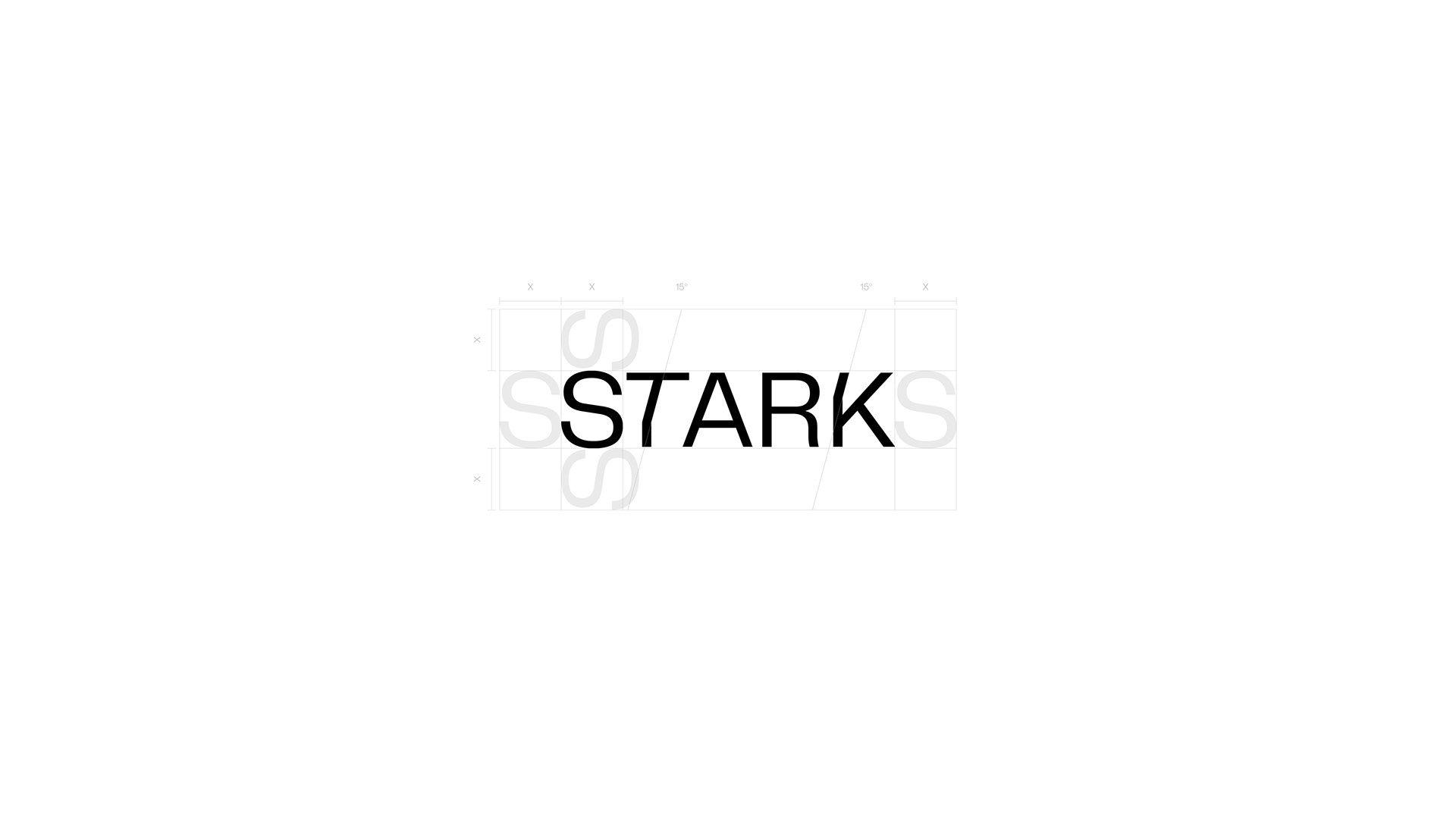
Harmonious blend of warm tones inspired by nature's palette, reflecting the earthy warmth of natural landscapes.

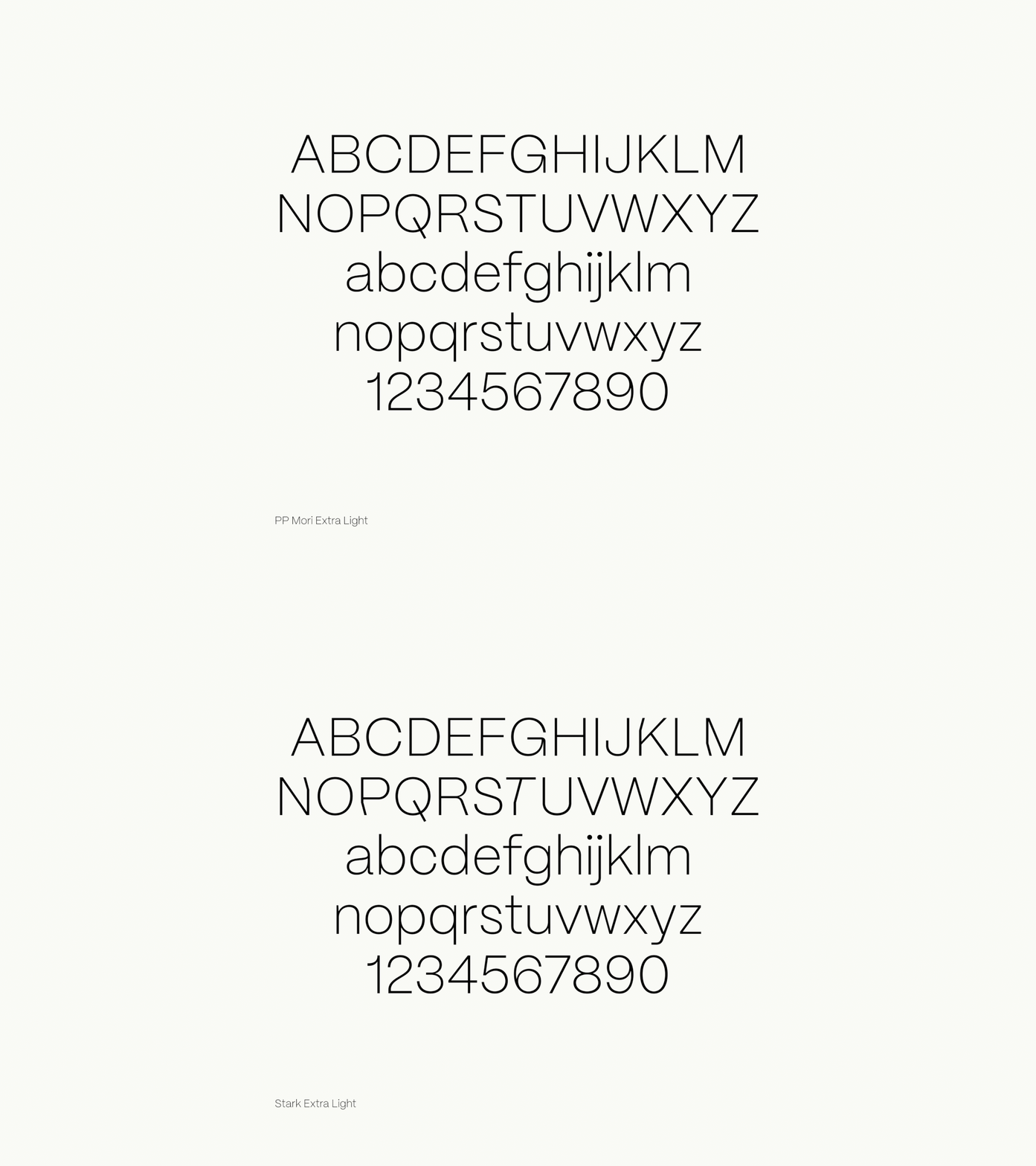
STARK's bold voice expressed through the PP Mori font, a versatile gothic sans serif inspired by contemporary Japanese design. However, the brand’s key messages should be highlighted by a custom made font, meticulously tailored to echo the style of the logo. This font reflects a balance between playful innovation and a sharp, clean aesthetic. Its design exemplifies STARK's commitment to flexibility and innovation, ensuring a compelling visual impact for the brand's key messages.
The essence of STARK's design ethos finds expression in the architectural lines and blueprints, a striking visual element inspired by the graceful contours and graphic perspectives of STARK's architecture. Alternatively, they can take center stage, becoming a bold, eye-catching feature of the composition, echoing the brand's innovation and aesthetic finesse.
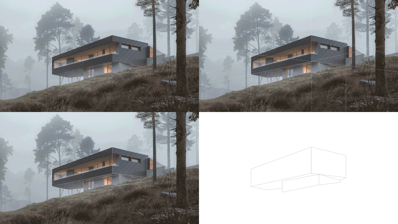

The layout system embodies a seamless fusion of functionality and aesthetics, manifesting a light and clean design approach. It effortlessly weaves together key brand elements such as messages, slogans, and images, creating a harmonious dialogue between nature and architecture.

The photostyle captures an interplay between nature and architecture, focusing on the communication between the two. Warm tones dominate, evoking a sense of comfort and tranquility, enveloping the viewer in a serene ambiance. The emphasis lies on nature's embrace, highlighting the brand's connection to the environment.
The brand communication should also highlight the tactile richness of the natural textures (such as wood, concrete, and paper) they use. These textures serve as a tangible embodiment of the brand's connection to nature-tecture.
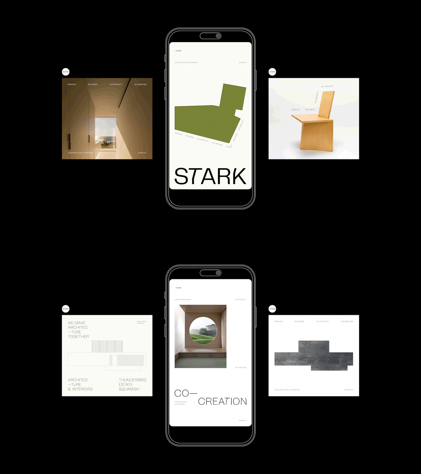
The rebranding effort culminated in a brand that embodies STARK's passion for exciting architecture, its commitment to sustainability, and its collaborative spirit. The new visual identity, from logo to layout, reflects the thrill-seeking essence of STARK, creating a cohesive and compelling narrative. The website, soon to be relaunched, will serve as a dynamic platform to showcase the brand's holistic design experiences and stark individuality.
The impact of the rebrand is evident in how it aligns with STARK's values, resonates with its audience, and positions the brand as a leader in innovative, sustainable, and exciting architecture. The unity of brand elements amplifies STARK's essence, inviting audiences not just to view but to engage with the brand's story—making architecture not just a visual experience but a sensory journey.


