Largest supplier of wine and spirits
Luding Group is one of the oldest alcohol companies with 30 years of market experience. Using its knowledge, the company shares its expertise, sets up trends and creates a culture of responsible alcohol consumption or as we named it – a new wave of drinking culture.
Brand Strategy Brand Name & Slogan Brand Architecture Brand Design Packaging Design Brand Guidelines Communications Strategy

Luding Group has a number of sub-brands, including a b2c platform, a wine concierge service, an educational platform and several other divisions. But all of them are not under the parent brand, which blurrs brand positioning on the whole.
The educational platform is of particular importance for the company. It is a sommelier school with courses in different languages for professionals and amateurs. The company's clients learn the culture of drinking in details as well as the history of alcohol, which allows them to independently make a choice in favour of a particular product.
Our goal was to change the perception of Luding Group among the target audiences and to shift away the visual perception of the brand as only an importer of alcoholic beverages. Moreover, we've made an accent on the brand's architecture, including an educational sub-brand and its positive influence on a new conscious culture of alcohol consumption.
We were inspired with the traditional attributes of wine and spirits culture in order to capture the unique features of Luding Group. The design concept was based on the brand's DNA: combining an innovative approach and years of leadership experience, to set high standards of product quality and services for the entire industry.

Luding Group drives a culture of production and responsible consumption, creating a special value for everyone.
We create a new wave of alcohol production and drinking by creating a special value for each person
We set highest standards of products and service quality for the entire industry by combining an innovative approach with years of the leadership experience
Innovation Responsibility Credibility

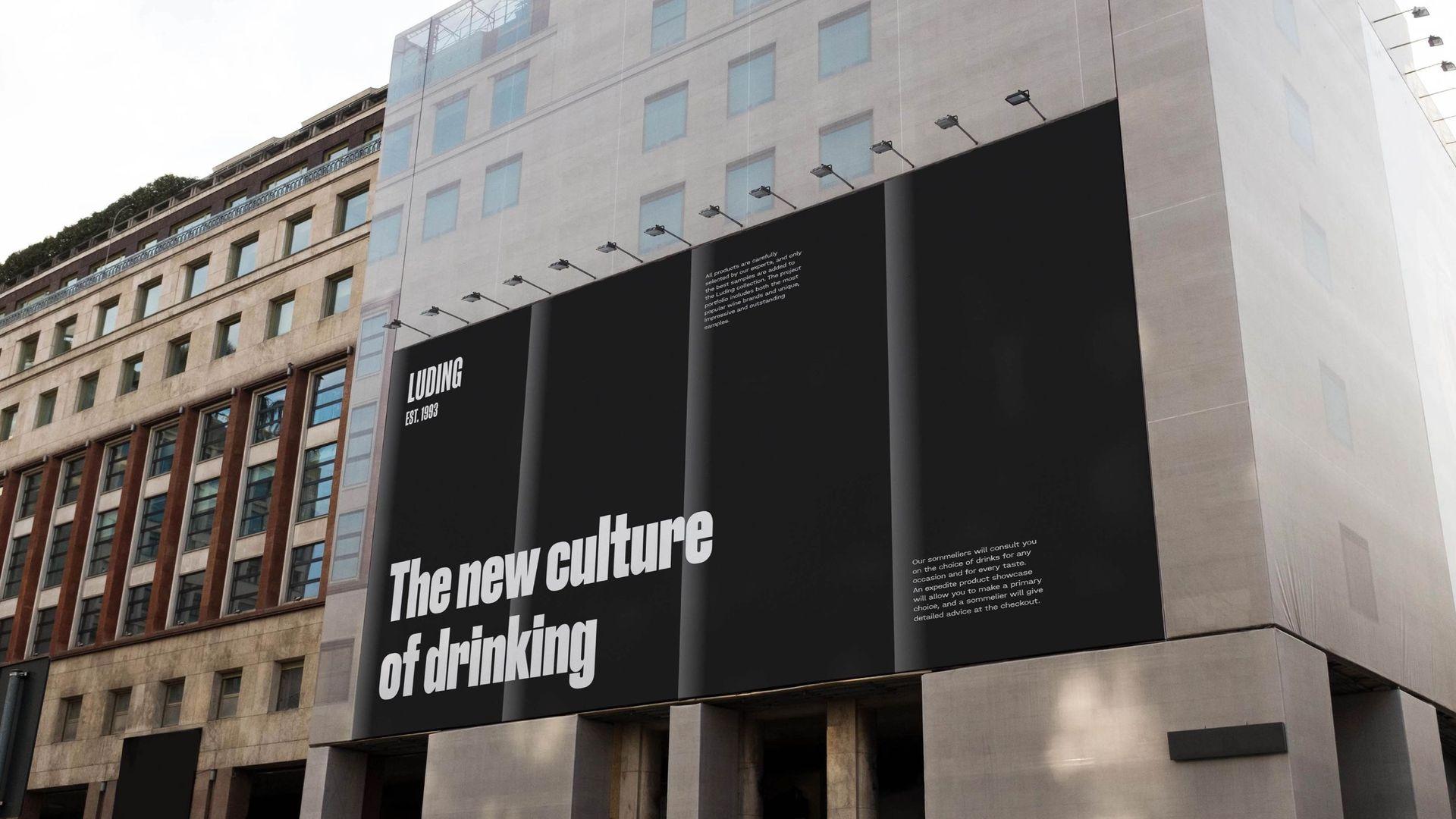
The logo is a wordmark without a sign. Its modern typeface is rooted in the past, maintaining a poster style. It is designed to be large, and brings with it a sense of magnitude, strength, and fundamentality.

In order to emphasize the brand's integrity we created monolithic architecture and unified several sub-brands.
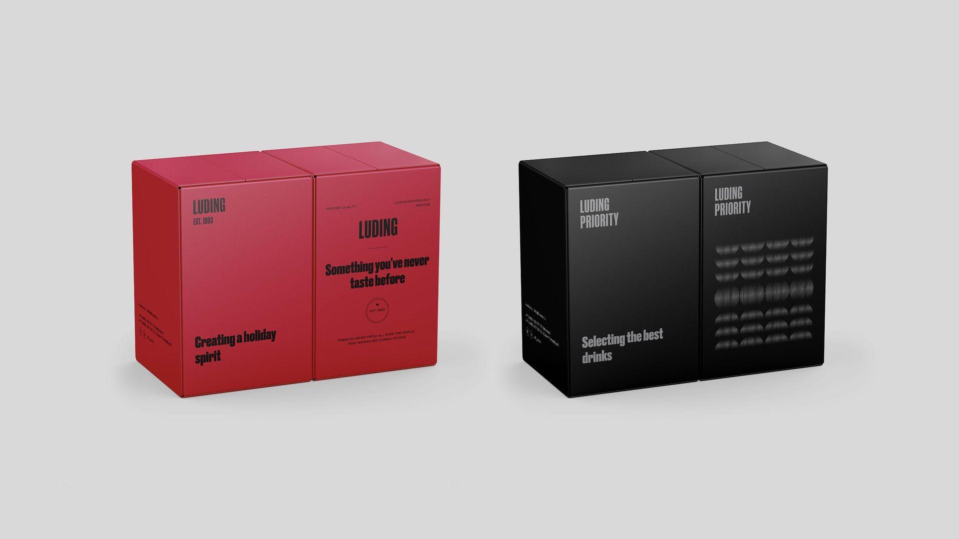
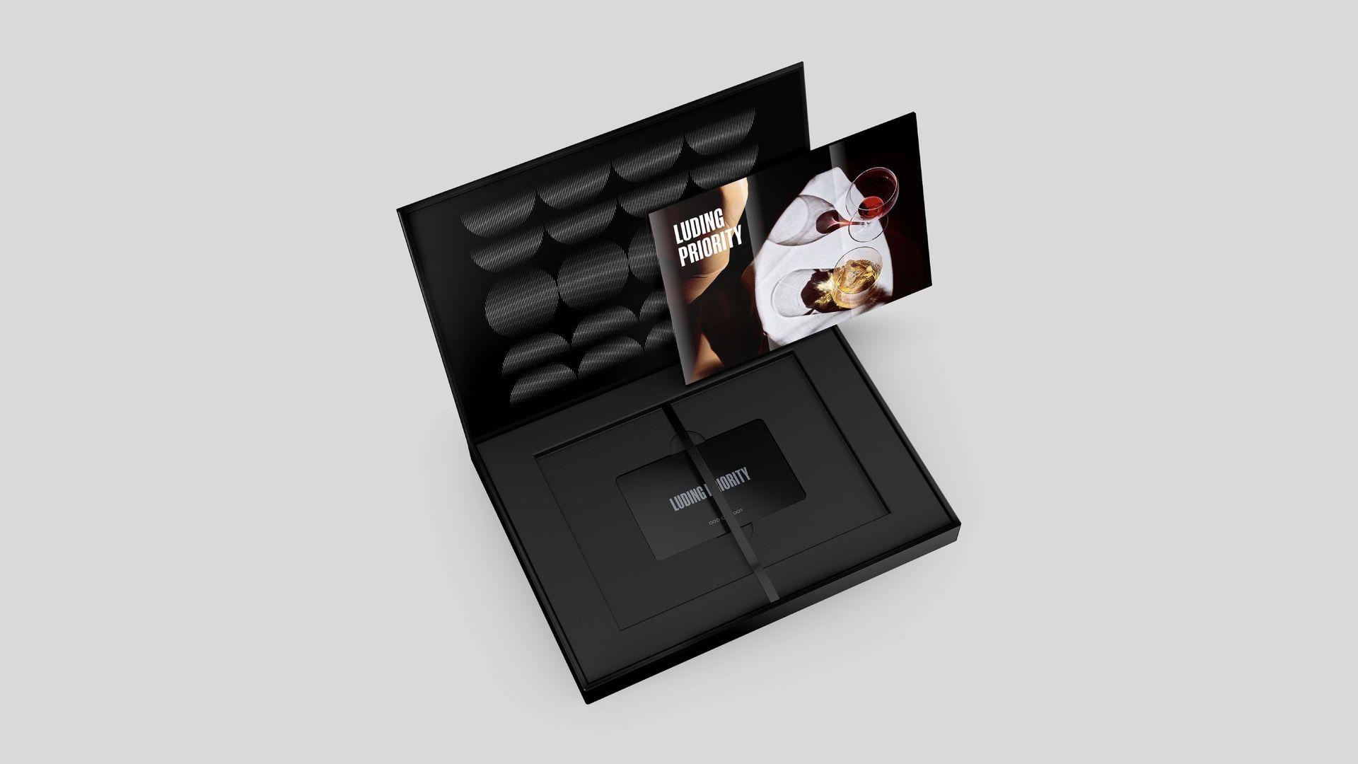
The parent brand was named Luding Group; b2c-direction was renamed to Luding and united a number of other divisions. The wine concierge service was named Luding Priority.

The design concept was based on the DNA of the Luding Group , expressed by its mission: combining an innovative approach and many years of experience as a leader, to set high standards for the quality of products and services for the entire industry.
The experience of a leader is his history and traditions. In order to convey the characteristic features of a brand with a history – its solidity and responsibility, and at the same time create a relevant image for all target audiences, we were inspired by the traditional attributes of the culture of wine & spirits and created a unique corporate identity in accordance with the latest trends in graphic design.

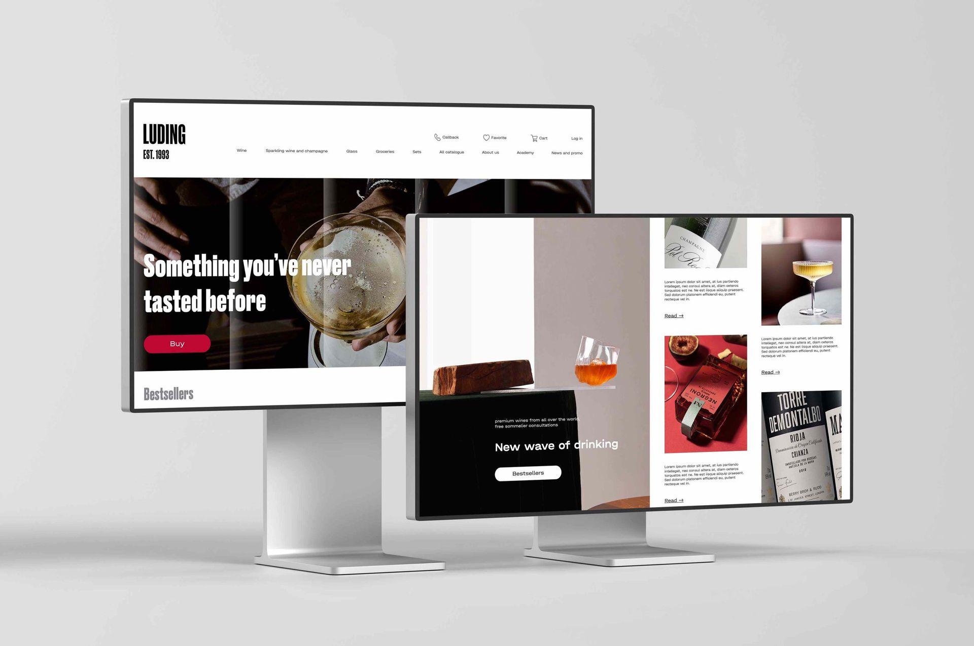
We used vibrant and bright colors for this design system. They are perfect to use in digital communications and benefit the brand's ambition in keeping up with the changing times as well as with the ambition to be a leader who creates its own rules of the game for other to follow.

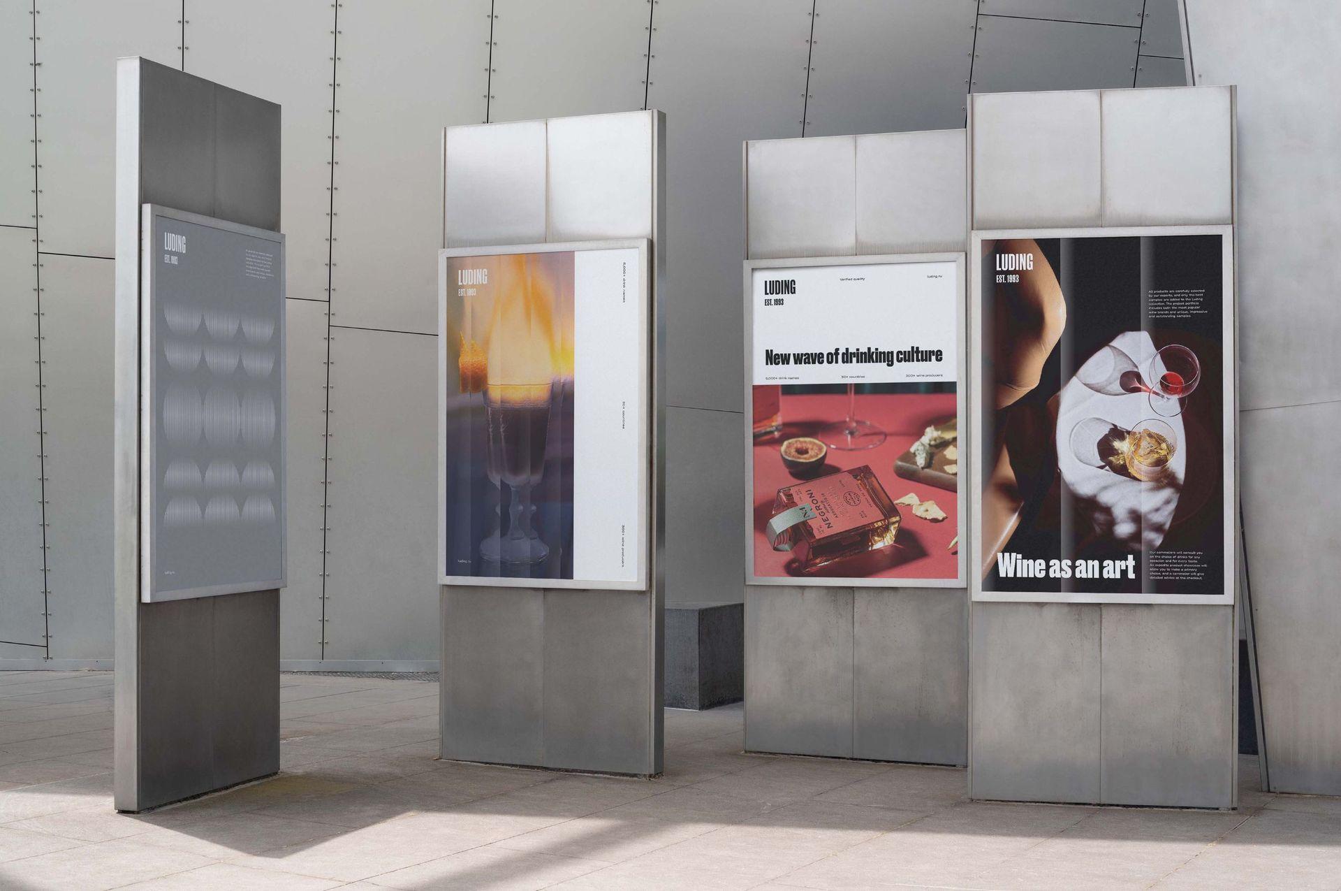
The pattern also resonates with the image of glass. The game of light and shadow, the tactile effect of the facets, the transparency and rhythmic lines repeating – all refer back to the very essence of the company – the creation of a culture of production and responsible consumption.

The layout system refers us to the style of the bottle label. The history of the label has come a long way over the centuries from a utilitarian function to a piece of art.
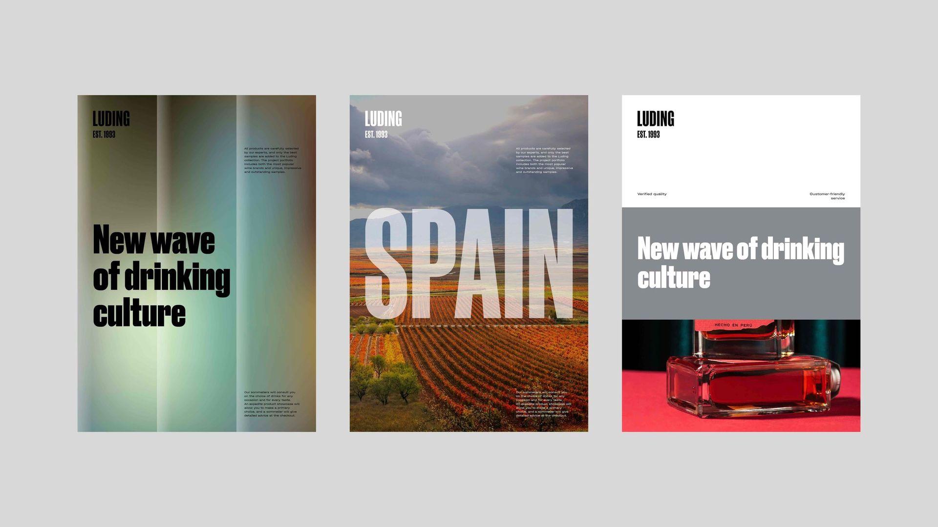
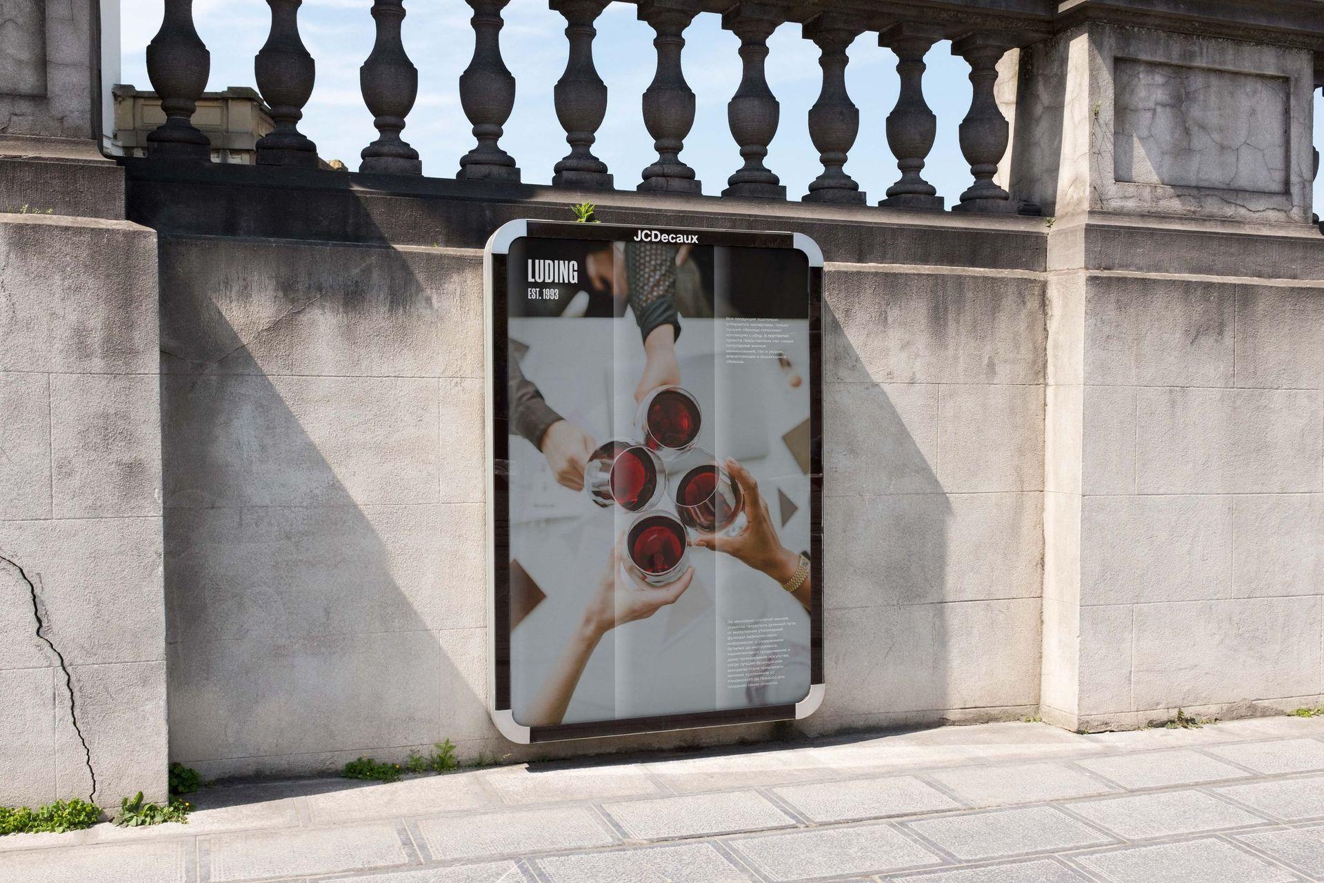
To create a recognisable photostyle we used lifestyle images of drinks and cocktails. Staged compositions with elaborate staging create a sense of presence, inviting the audience to enjoy the atmosphere created by the brand. By using the faceted glass effect filter, we create a memorable, unique appearance that can bring any image collection to a single style.
As a result, a unique visual language of the brand was created, emphasizing its character, scale, and new role as an enlightener. Thanks to the new visual identity, it is easier for the company to communicate with a wider audience. The visual emphasis on the company's educational activities marked the essential role of its brand not only for the partners, but also for society.
