Solutions to improve the human life
One of the biggest challenges facing the world in the 21st century is unprecedented population growth. It requires a more sustainable approach to agriculture in order to provide people with healthy food. The new digital startup aims to provide local farmers with new ag-tech solutions to make their life and work better.
Brand Design Brand Guidelines Web & App Design Pop-up Design

Our goal was to create an image of a cross industrial company. The brand had to be interesting for the farmers as well as for the investors and IT-specialists. In other words, the new brand had to create an image of a "green", but at the same time technological company.

In order to create a brand which refers to traditional farming but offers innovative technologies for covering farmers’ needs, we reimagined a common image of «green» farming and created a high-tech version of a future sustainable agro tech company.


The design is based on the geographical forms and shapes of the fields, and the way they are depicted on paper and digital maps. The unique landscape the boundaries of which are formed by nature and man is a direct analogy to the brand concept itself, which stands at the intersection of technology and agriculture.

Wordmark font is a contemporary grotesque exploring the space between mechanical sturdiness and expressive clarity. The square shapes and stable base gives the font technical and sustainable feeling.

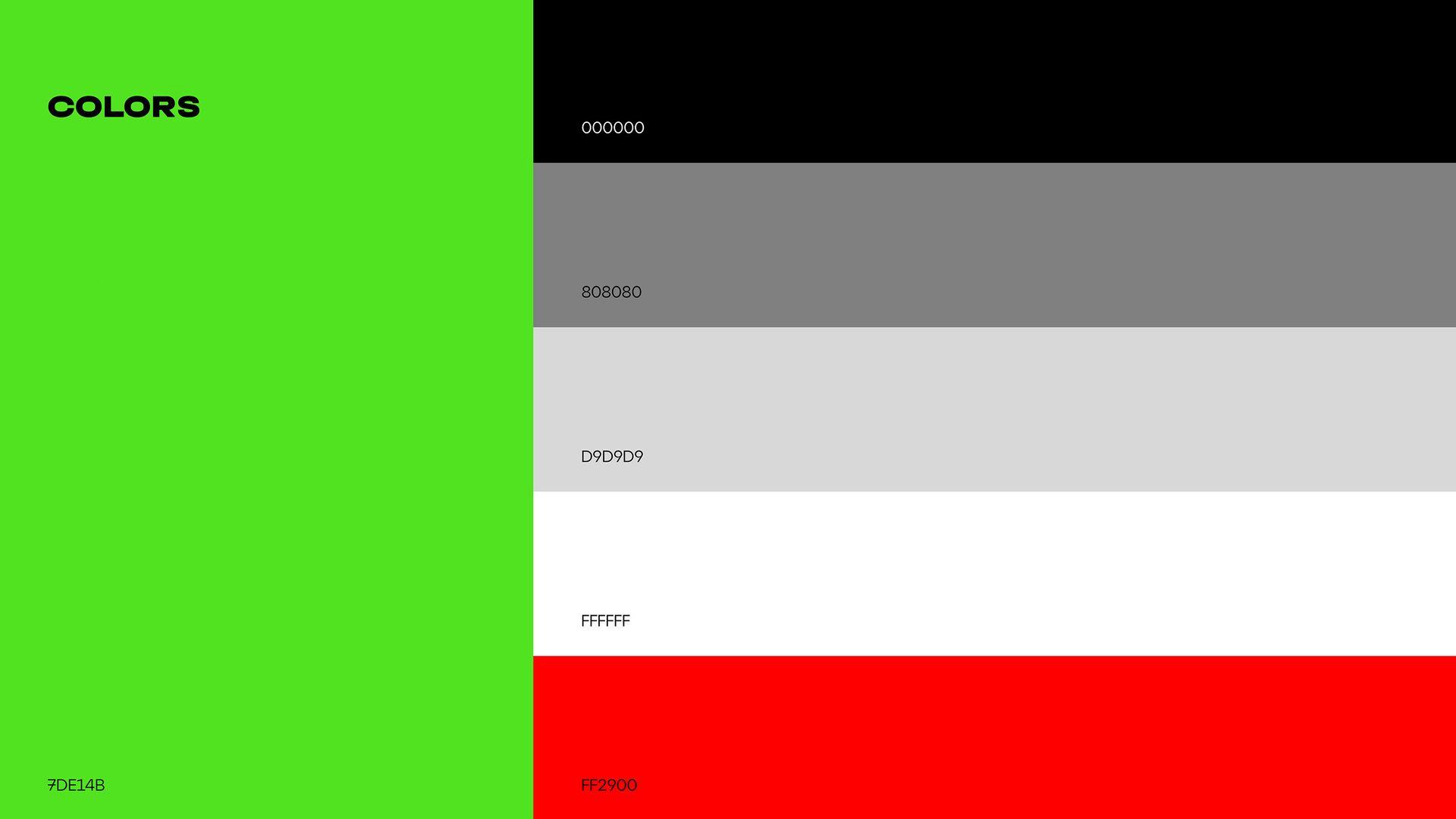
Natural colors, green and orange, take on more artificial shades adding a sense of modernity and technology to the design.

Inspired by the shapes of fields created by nature and human beings, we made design elements in the shape of minimalist map images. These forms can be used both as separate elements and together with callouts and infographics. Forms can be filled with a solid color or with different types of strokes. They can also serve as frames for text content or images.
We offer a variety of layout system. Design elements in the shape of maps, infographics to demonstrate big data and shapes to fill in with images. Images can be also supplemented with infographics, emphasizing certain places on it.

Tecrop provides farmers with innovative digital technologies so the main points of contract for the brand's target audience are the website and mobile app. We created a user-friendly design for digital collaterals which reflects the positioning of the brand and represents scientific data in a way that is easy to comprehend and put to use.
As a result, a clear brand positioning and a unique visual language have been created. The new brand image has made it easier for the company to communicate with a wider audience, demonstrating its expertise in both agriculture and technology.
