Your exclusive partner in the development industry
Synterra Group is a real estate development company that has successfully completed a number of development projects. Synterra Group incorporates Synterra Construction, a construction company, and Synterra Oil, an oil trading company. Synterra Group engaged us to create a brand identity for the group of companies.
Brand Startegy Brand Naming Brand Architecture Brand Identity Corporate Website Communications Strategy Merchandise Production
The construction industry is beginning to function in accordance with the technological ecosystem principles. There is now a demand on the market for more transparent and more technological construction and operation processes. By adopting a new approach to business operations, Synterra Group is prepared to meet this demand.
Becoming the most sought-after business partner on the premium real estate development market
To pioneer the creation of a fundamentally new qualityof business processes based on essential values and long-term trustworthy partnerships
Innovation Integrity Openness Perfectionism
We had suggested a list of more than 50 names, from which the Client chose the Synterra brand name. This name was formed by merging the words Synergy and Terra (earth). The Syn- prefix has connotations of unity and symbolizes trustworthy partnerships as an important aspect of business operations of the Company. Sonorant consonants of [n] and [r] add vigor to the word, making it roll off the tongue easily.
Synterra Group was proposed to be used to denominate the group of companies. Subsidiary companies were given names based on the irprincipal business operations (i.e., Synterra Construction and Synterra Oil).
We developed distinct visual styles for three brands (Synterra Group, Synterra Construction and Synterra Oil). The design concept aims to reflect the reliability of the Company with rigorous structure of business processes.
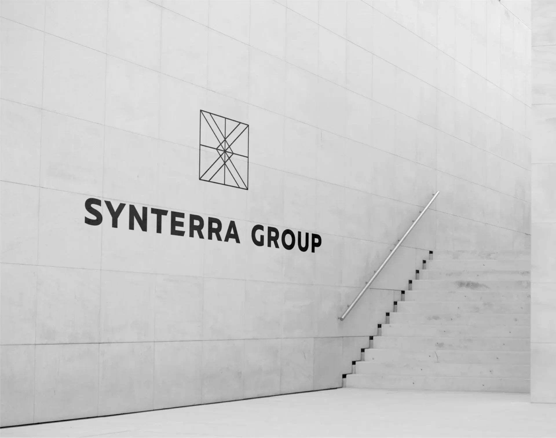
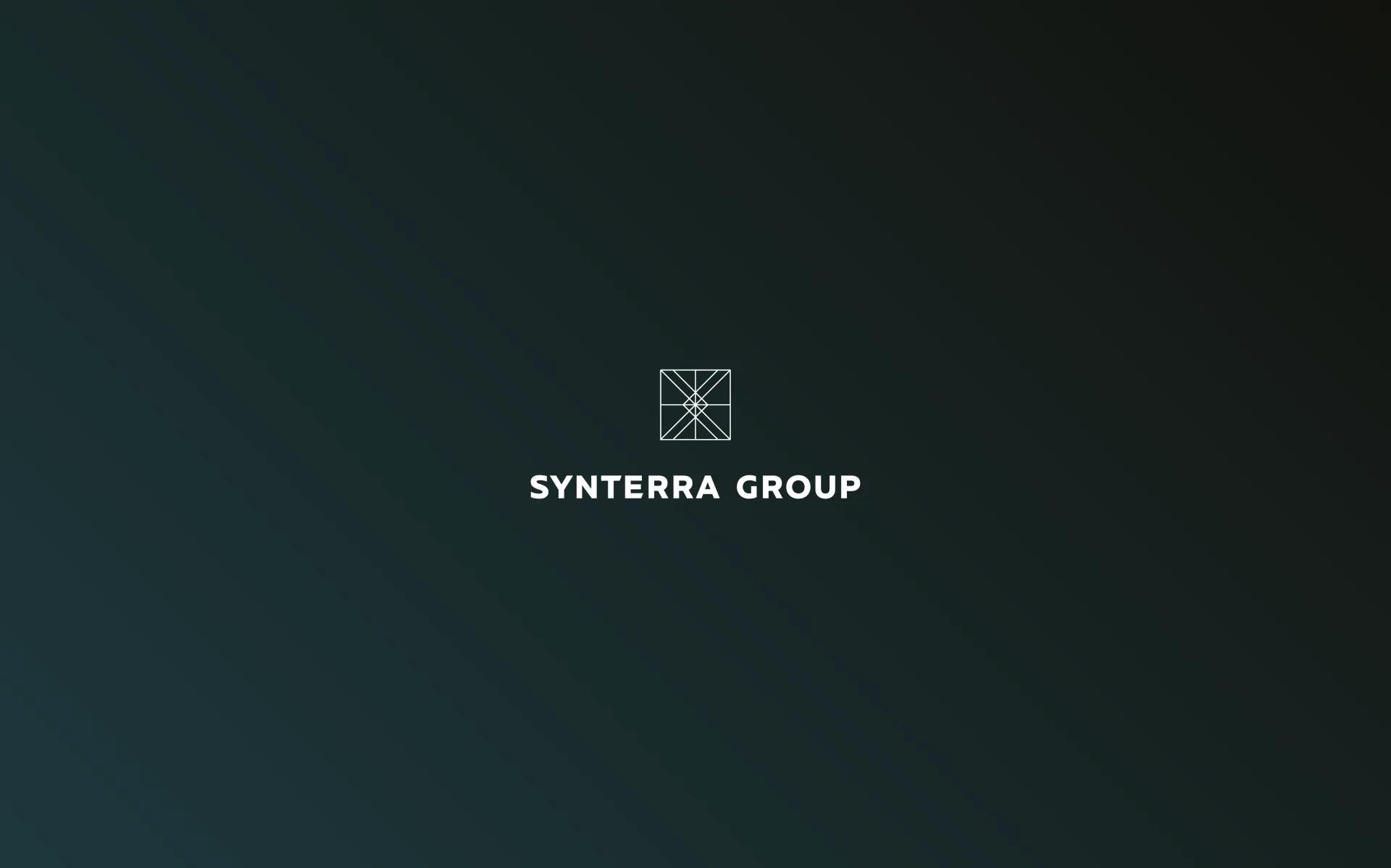
The square shape of the logo symbolizes strength and thoroughness. The intertwined pattern within the logo brings about connotations of a well-oiled and intricate mechanism.
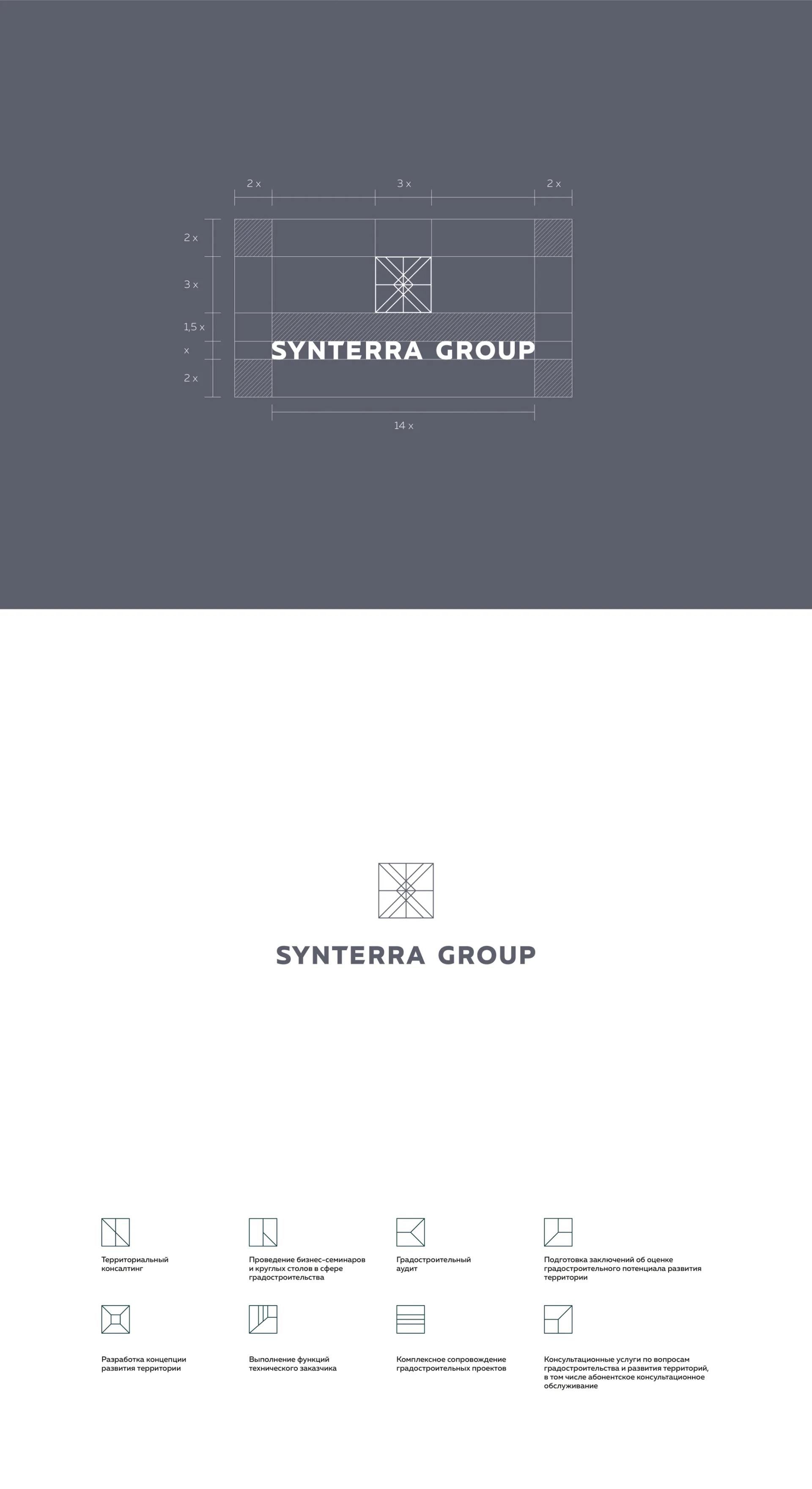
We also proposed the use of custom-made fonts of the Muller font family that may be utilized in online and offline media with ease.
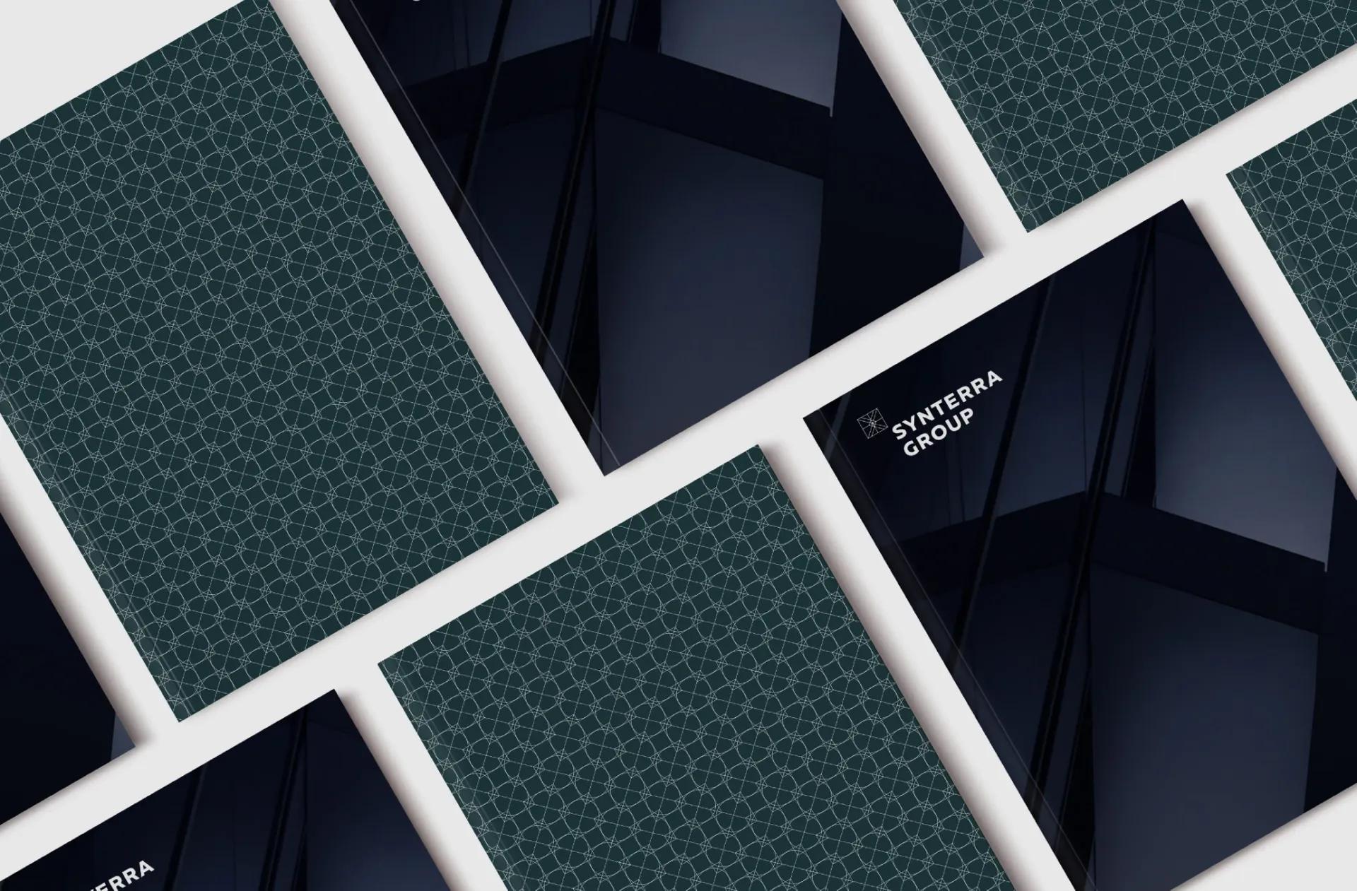
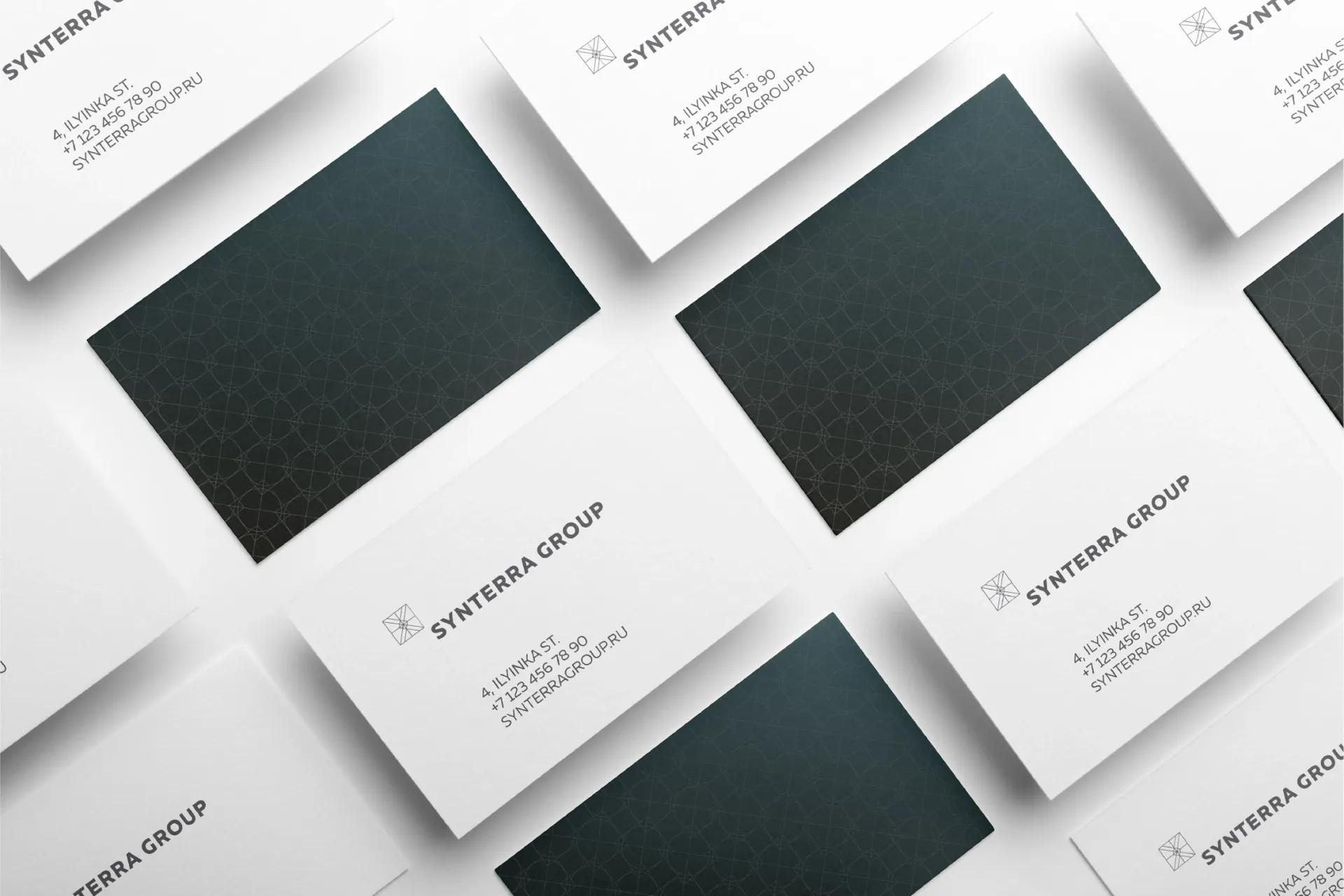
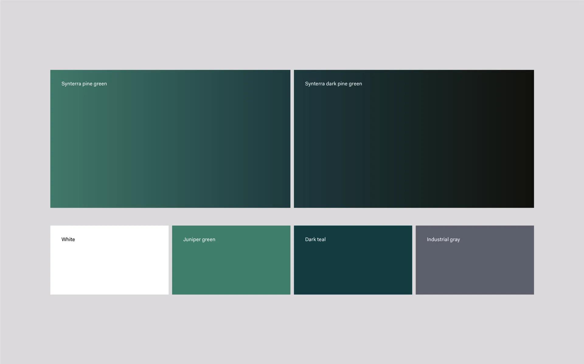
The primary corporate colors include gray, white and two shades of green. Their proper usage provides for a distinct visual style and integrity of the design throughout all visual communications.
The carefully chosen corporate shade of gray is traditionally associated with flawlessness, virtue and balance. The green, which acts as an accent within the proposed color palette, adds to the feeling of integrity and balance.
We created a style-forming pattern which is based on repetition of lines, simple geometric shapes and their spatial projections. This pattern is to be used on branded communications whenever the use of the imagery style is not feasible or technically impossible. It can also be used in printed materials and souvenirs.

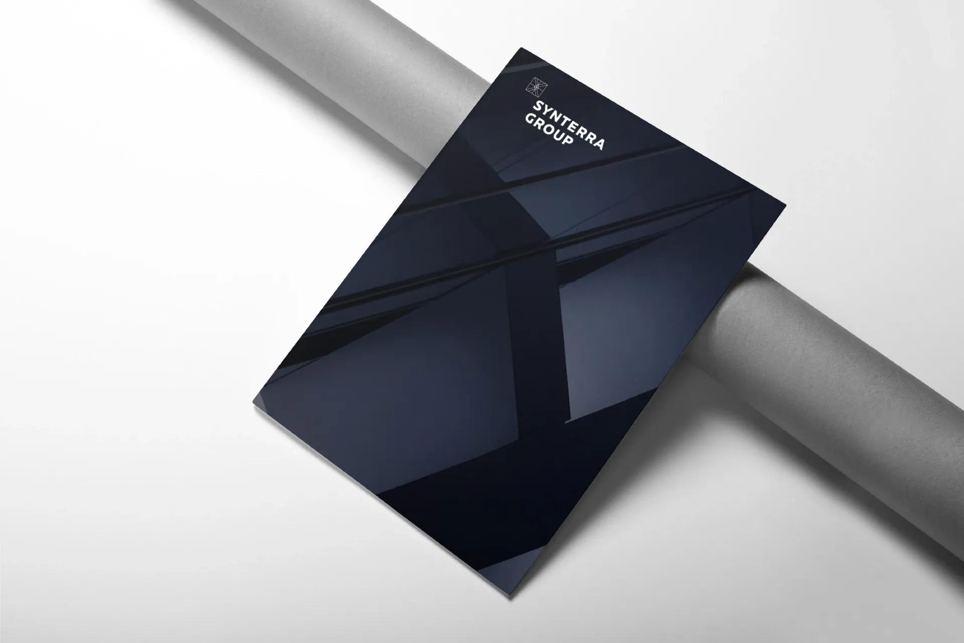
Brand strategy and visual identity standards were incorporated in the Company brand book. This document contains guidelines for the use of visual identity elements on various branded items, such as business documentation, annual reports and souvenirs.


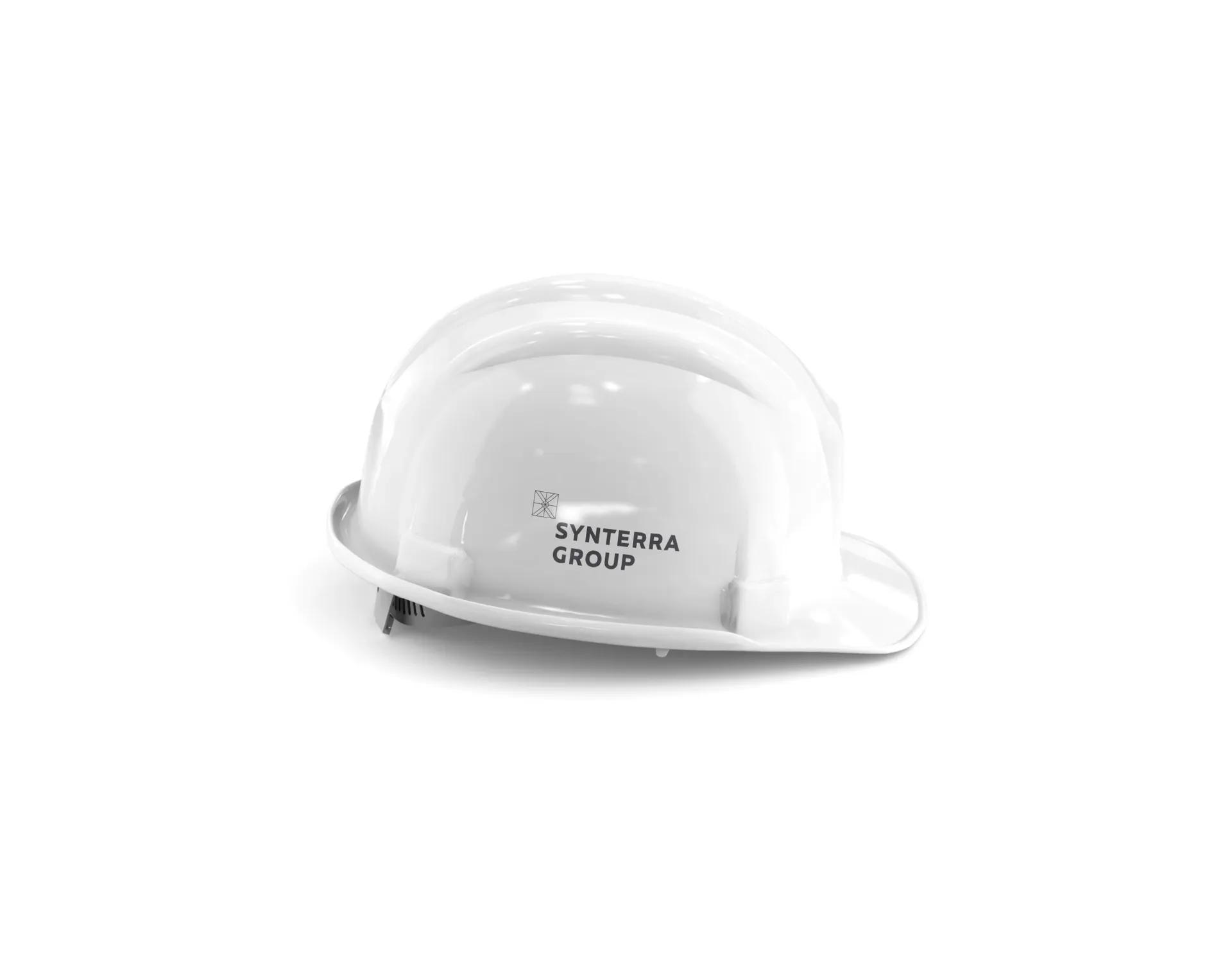
We also developed a website for Synterra Group, Synterra Construction and Synterra Oil. Furthermore, we have designed the Company office in accordance with the visual identity of the brand and printed sample business documentation and souvenirs.