Freedom to create your own world
Radical changes brought about by globalization and rapid advancement in technologies set higher standards in education and make universities rethink their position towards students, society, and the world as a whole. In this context, technical educational institutions take on particular significance. They are to train sought for specialists thus ensuring competitiveness for businesses and nations, and to mold responsible citizens and future leaders.
Brand Strategy Brand Name Slogan Brand Architecture Brand Identity Brand Guidelines Website Design
The Perm National Research Polytechnic University is one of the leading technical universities that provide human resources to manufacturers of the entire country. At the same time, its ambitions are not limited by the region as it was actively engaged in nationwide programs aimed to support the best universities. With the succession of generations within the University and the emergence of new challenges that call for global vision, Perm Polytech found itself in the need for changes in strategy, corporate culture, and positioning.
Along with a new strategy development, it was also decided to create a new brand for the University that was to reflect that strategy. We identified potential vectors of developing Perm Polytech’s brand. We created a brand platform that would focus on harmonious development of personality and on training leaders for the fast-paced world.
Inspired by science and creativity, Perm Polytech molds leaders for the fast-paced world, which is reflected in brand's proposition
Perm Polytech is a space for creativity, where students learn self-expression through academic disciplines in order to build their own path to achievements and contribute to the development of society.
Perm Polytech is a creative environment enabling those who succeed in blending fundamental knowledge, practical skills, capability of self-expression — all one needs to be in full control of their life and to bring together other people to pursue shared goals and great ideas so needed in the fast-paced world.
Development of an ecosystem that would be integrated in the local and global academic and business environment and that would encourage anyone to pave their own path towards achievements that make the world a better place.
Freedom Openness Ambitions
The brand's architecture is monolithic. In this version, there is one umbrella brand, however, each of the University branches (academic activity, research activity, business, and creativity) has its own brand version.

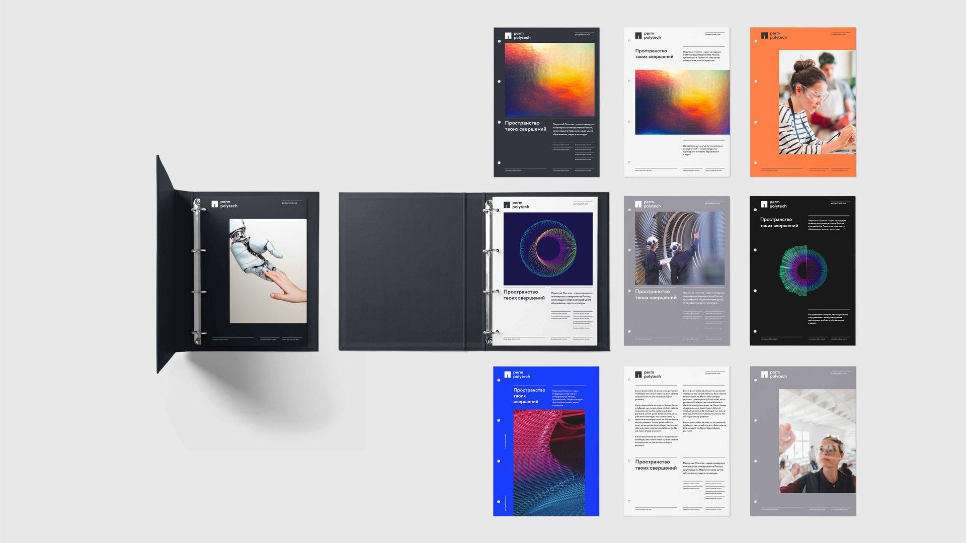
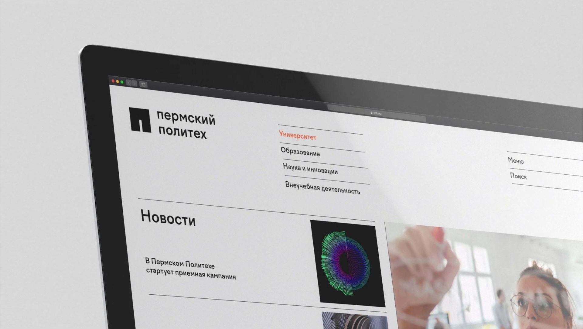
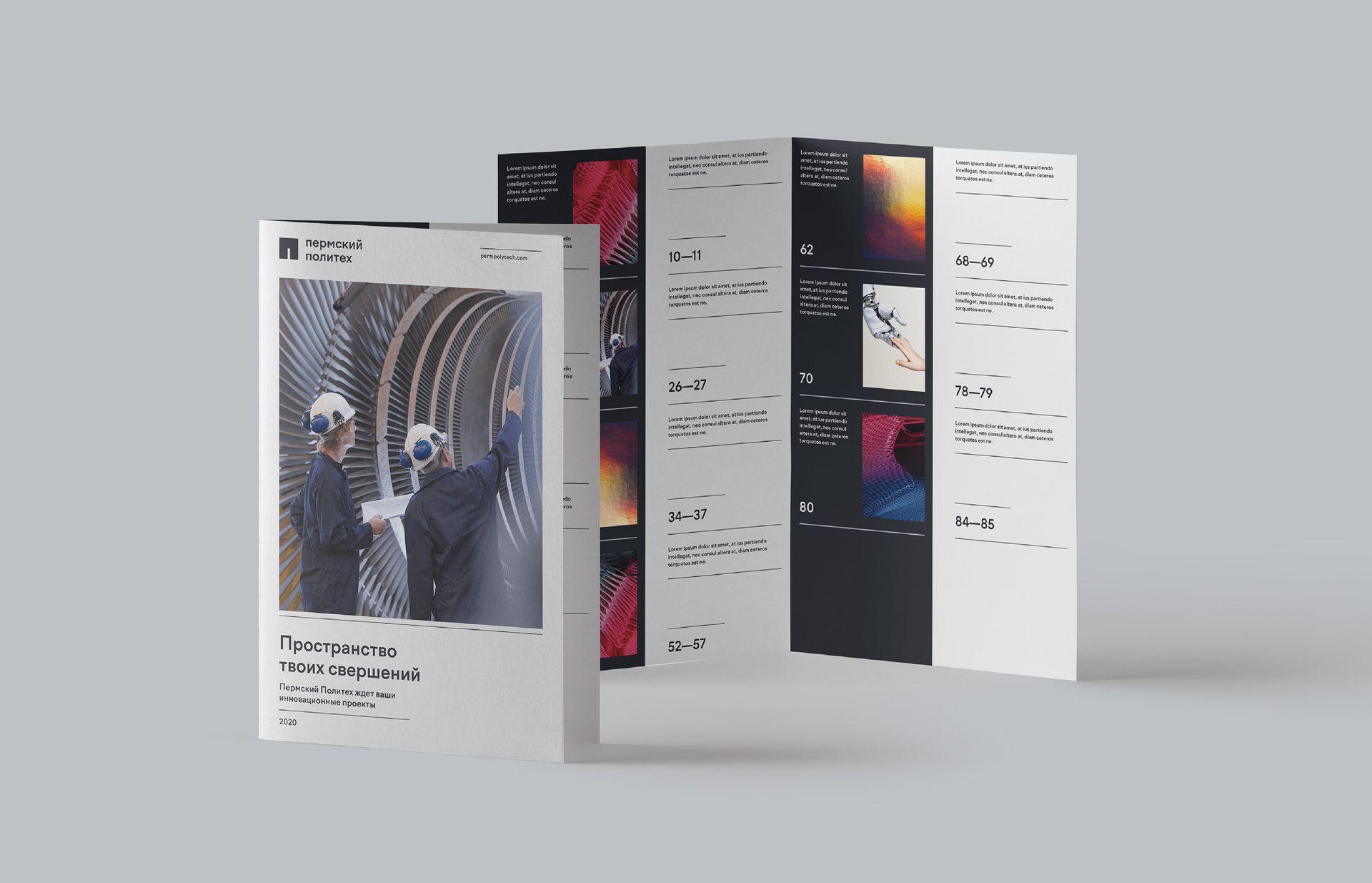
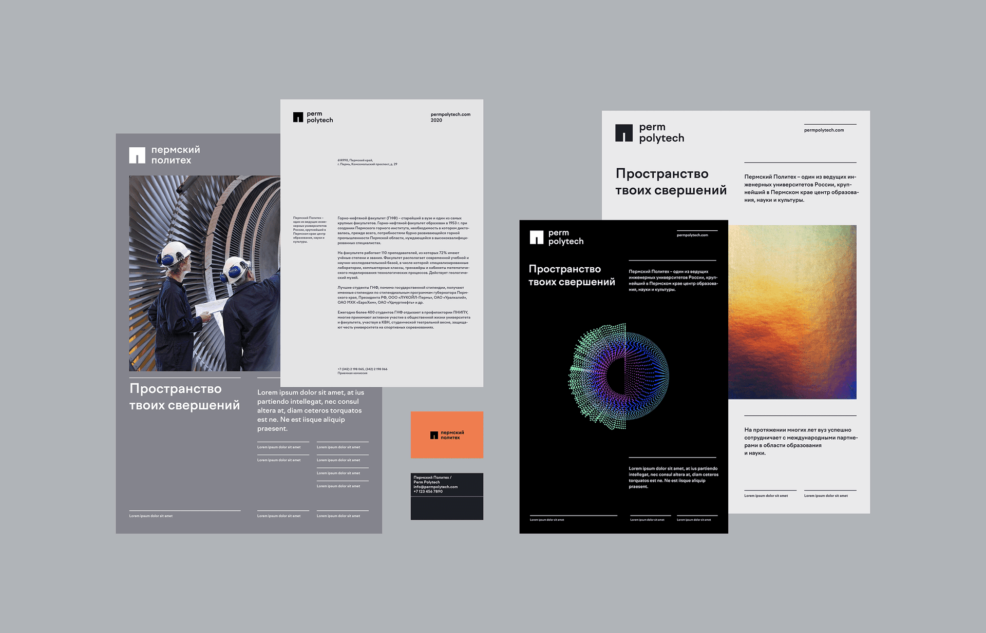
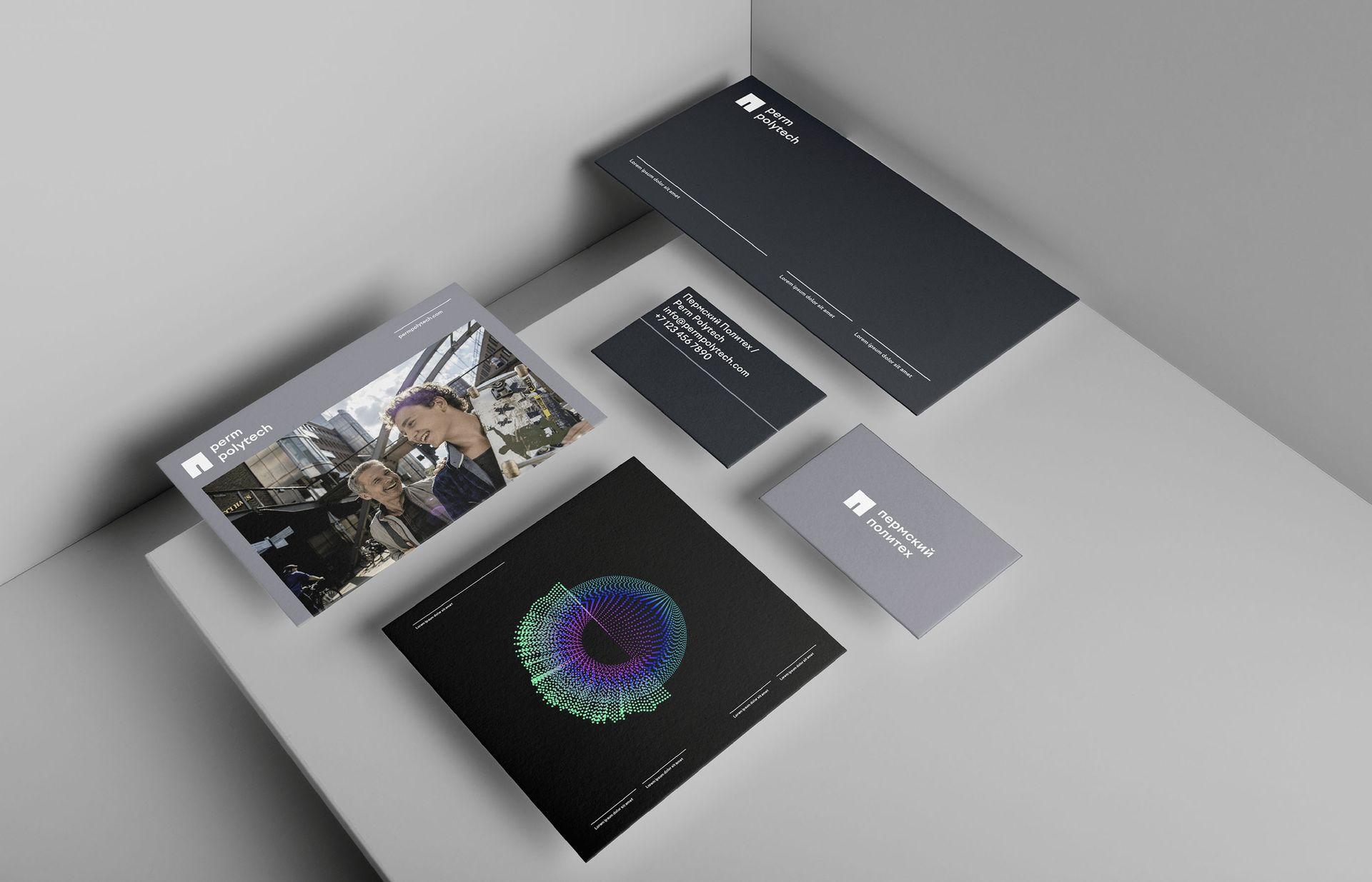
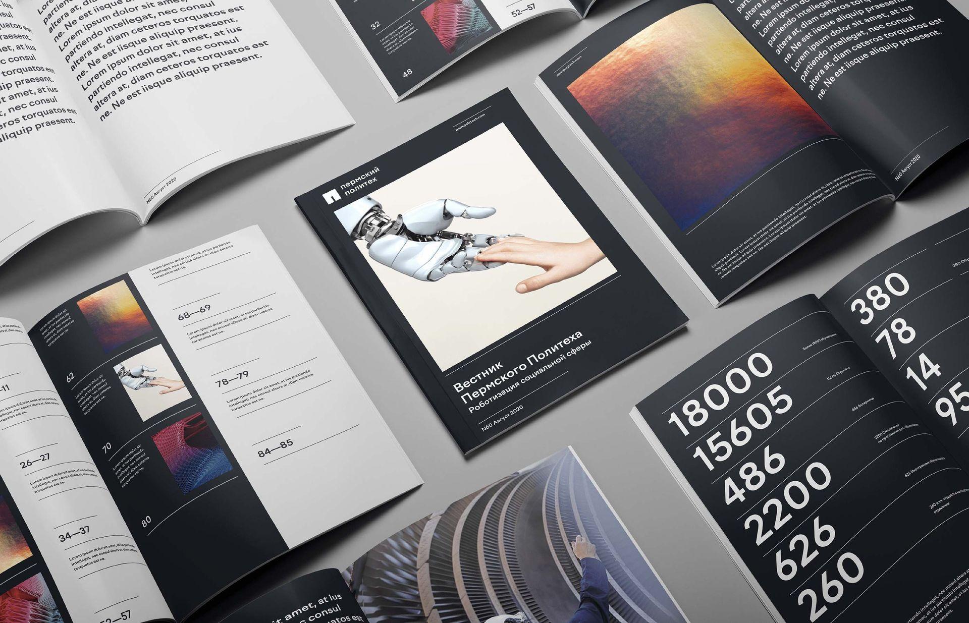
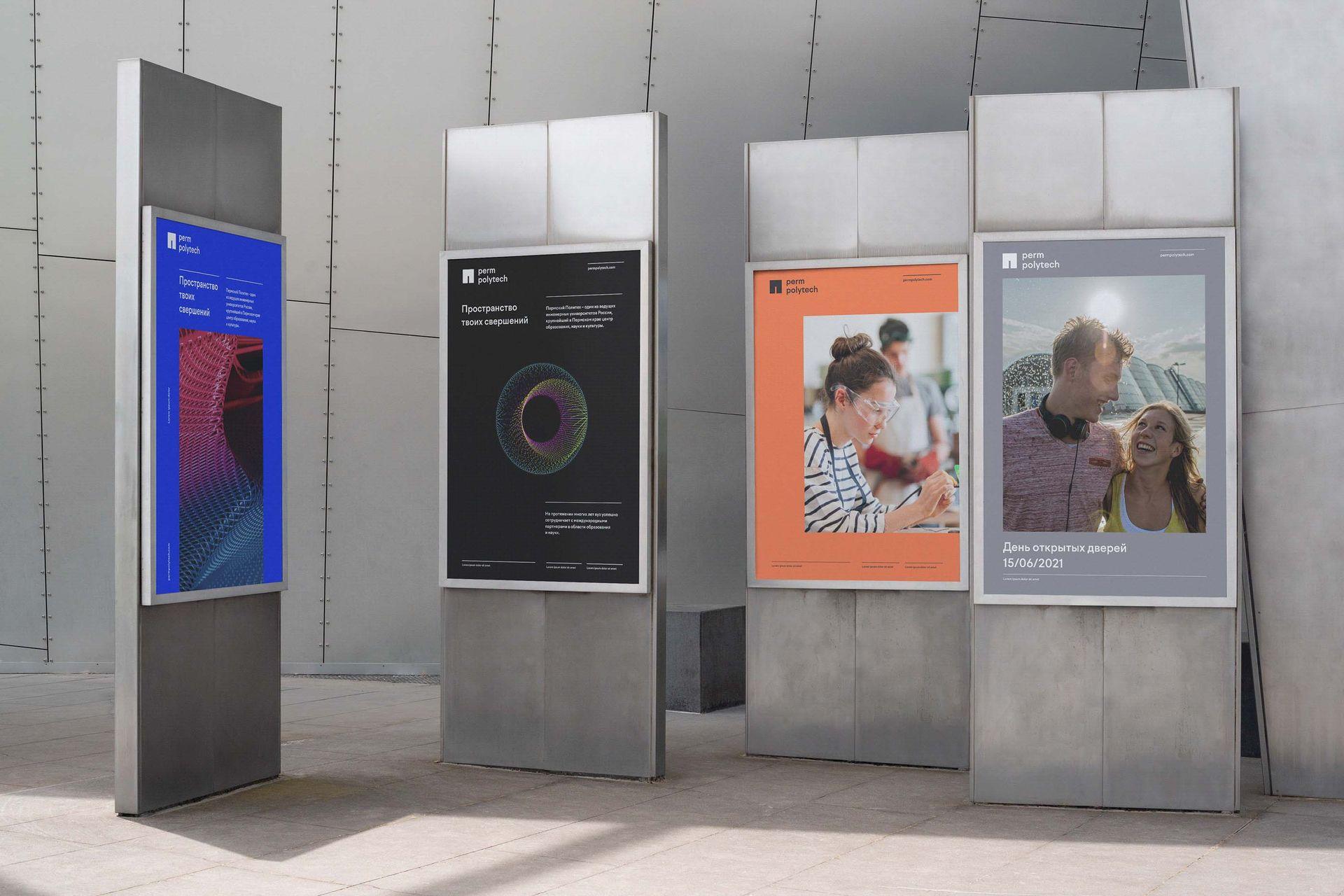
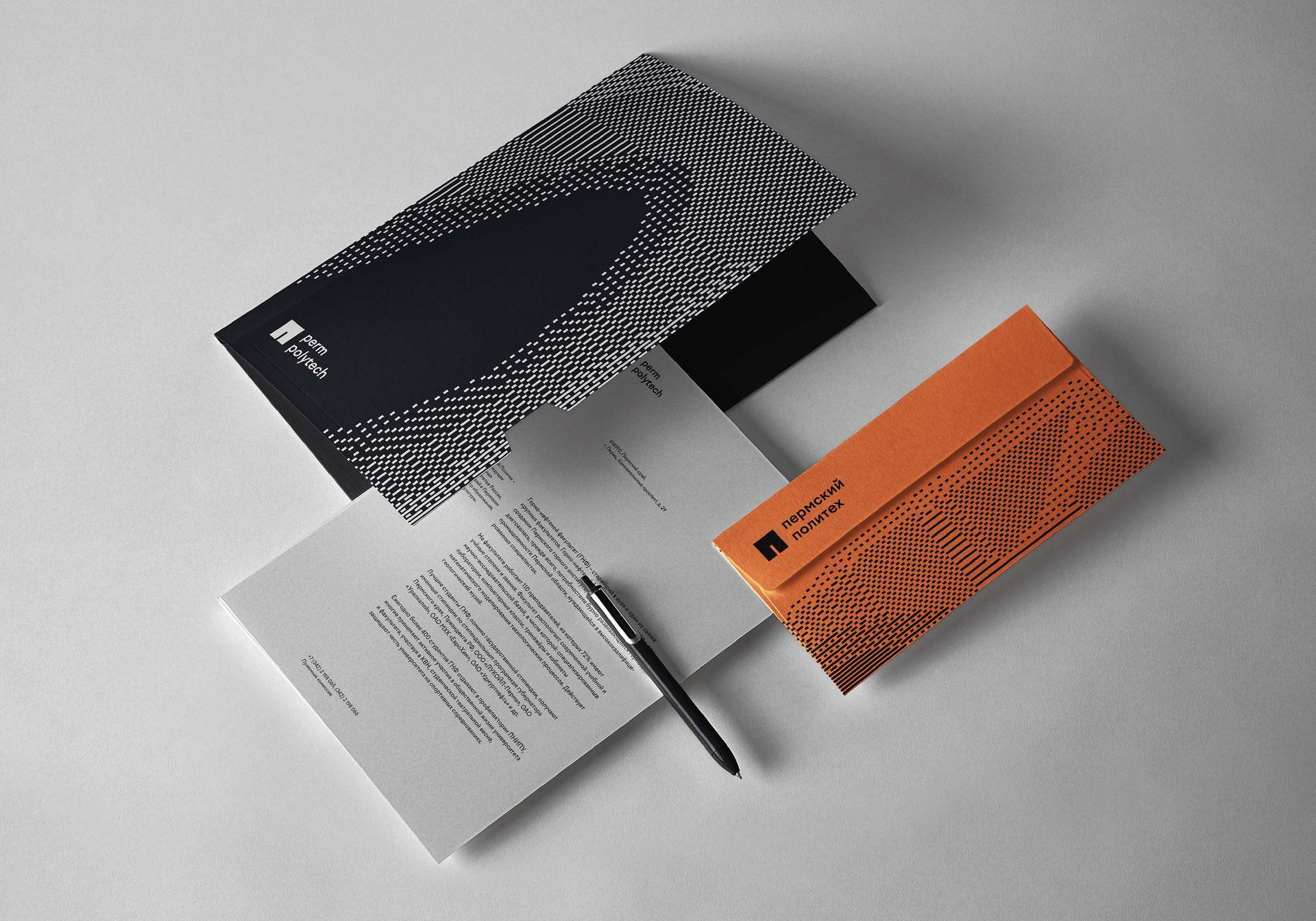
Following the new philosophy, the design concept is based on the idea that Perm Polytech is a creative environment where students learn how to express themselves through academic subjects in order to pave their own path to success and to contribute to the common good. All these values are reflected in the new brand design, including square shapes, lines, geometric grotesque of the fonts and chromatic colour palette complimented with abstract pixelated pattern, and anyone can find there a value that is meaningful to them.
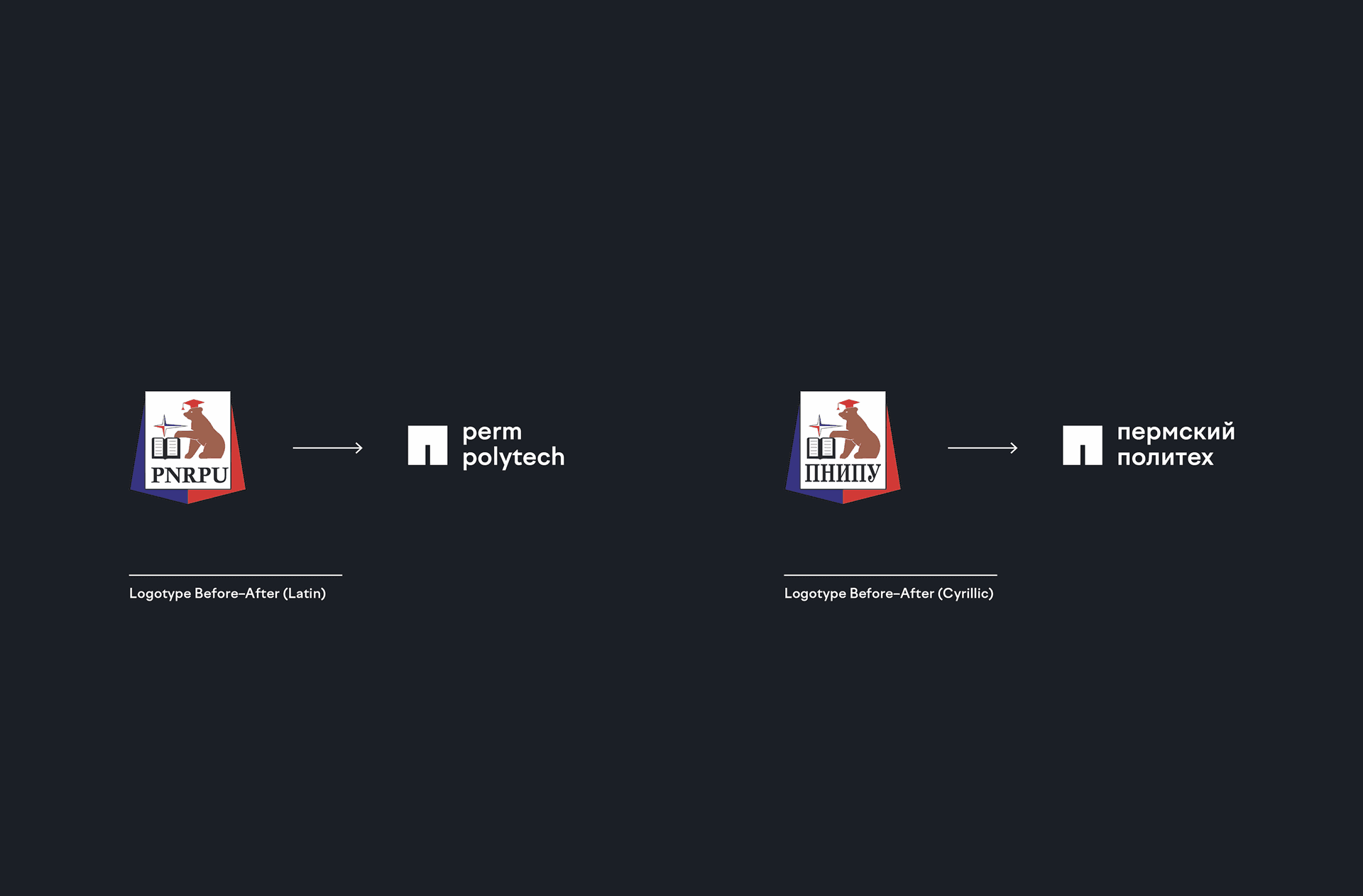
The logo consists of 4 main elements:
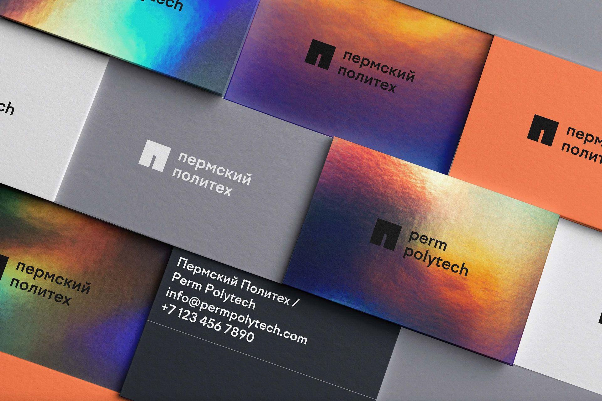
Factor A is a functional geometric grotesque, in a sense synthesizing the sansserif designs created in the early 20th century. It has low contrast, mix of rounded and sharp shapes, the same height for caps and ascenders. The font is rather versatile and can be used in both display and text sizes for branding, web projects, navigation etc.

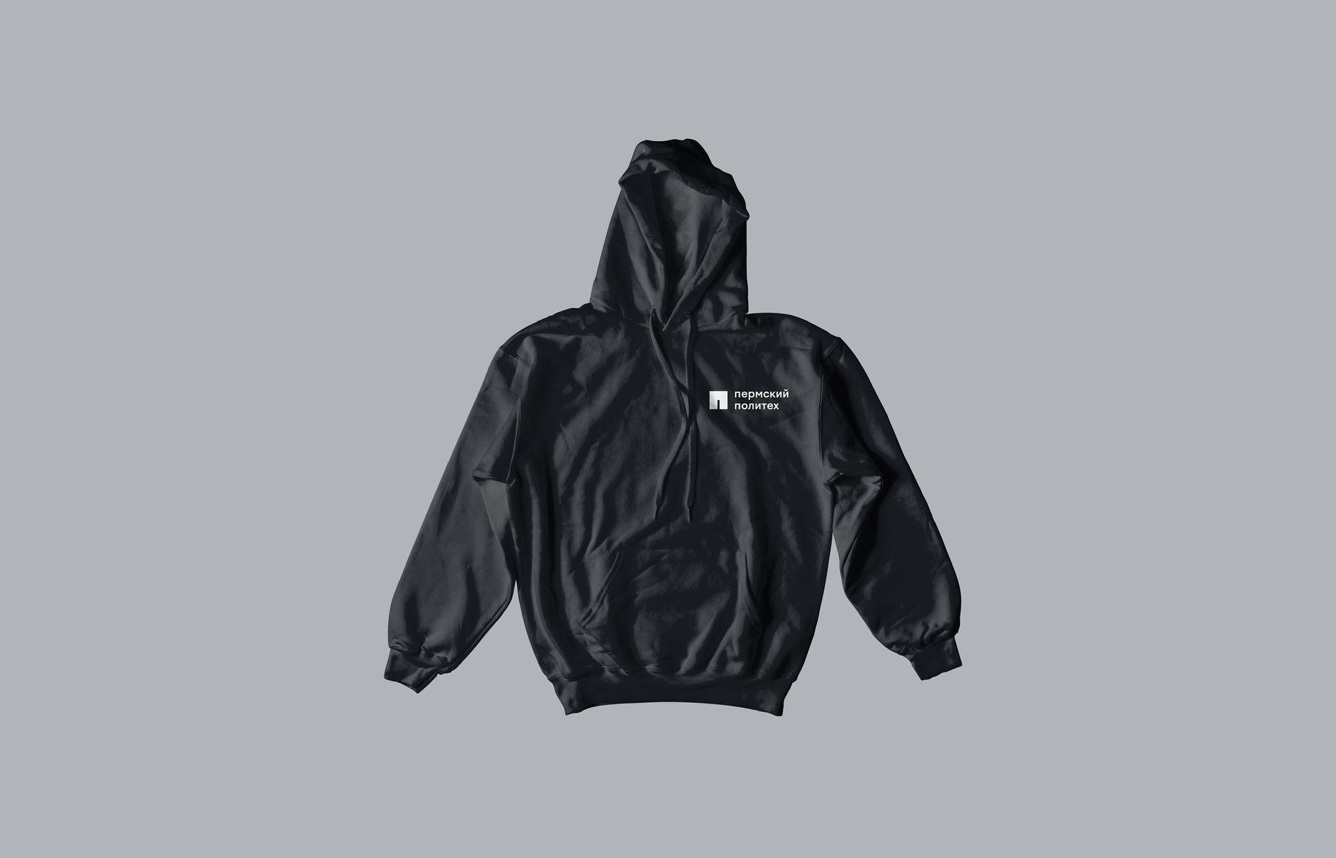
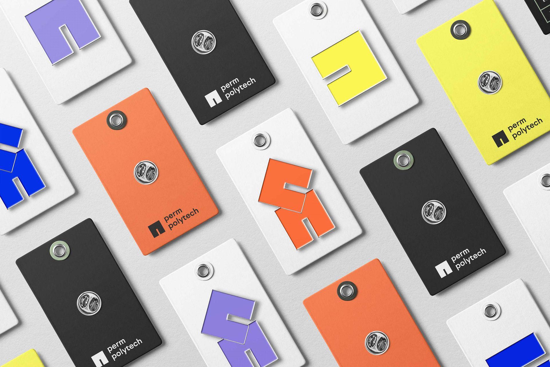
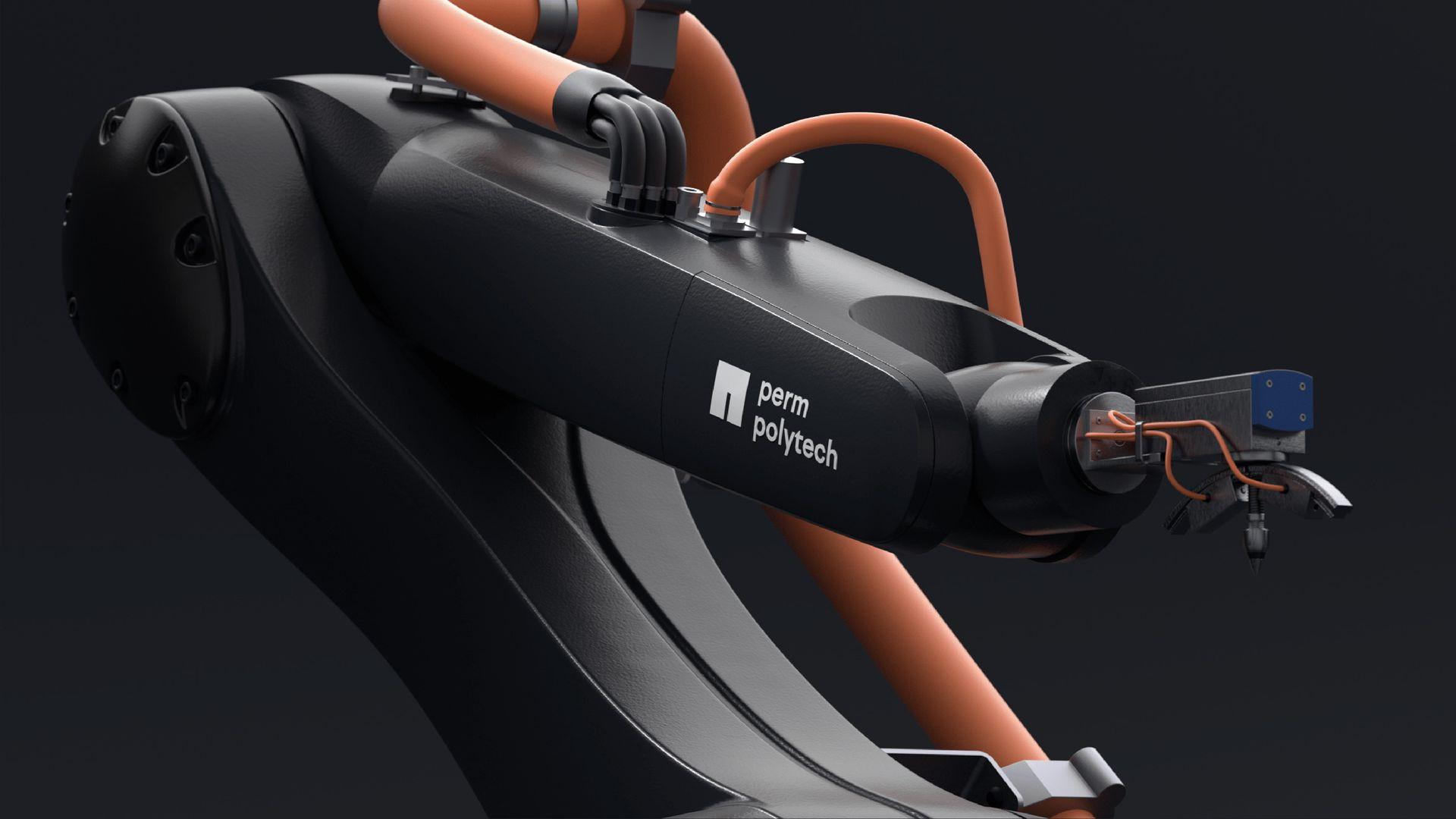
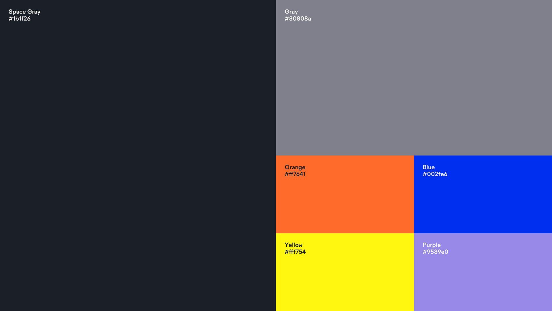
Space gray is used as a primary color. Besides being a symbol of infinity, it reflects intelligence and balance. The primary color is complemented with a monochromatic palette of lighter shades of gray and purple as well as with bright and vigorous accent colors — orange, yellow, and blue — that together make a palette of extremely "high-tech" colors.
As a pattern, we propose abstract pixelated shapes in various combinations and color gradations. These elements remind of heat maps which centers indicate energy clusters and which pixel structure refers to high technologies and digital environment.
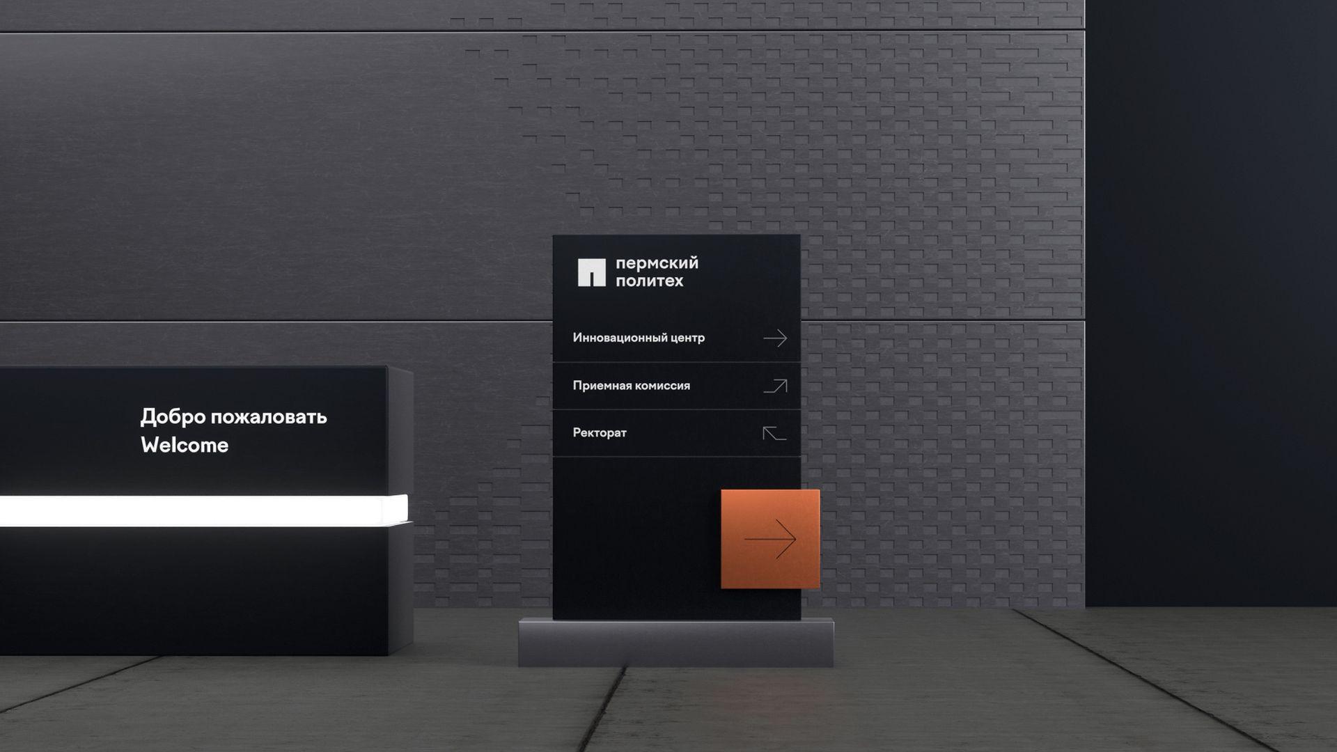
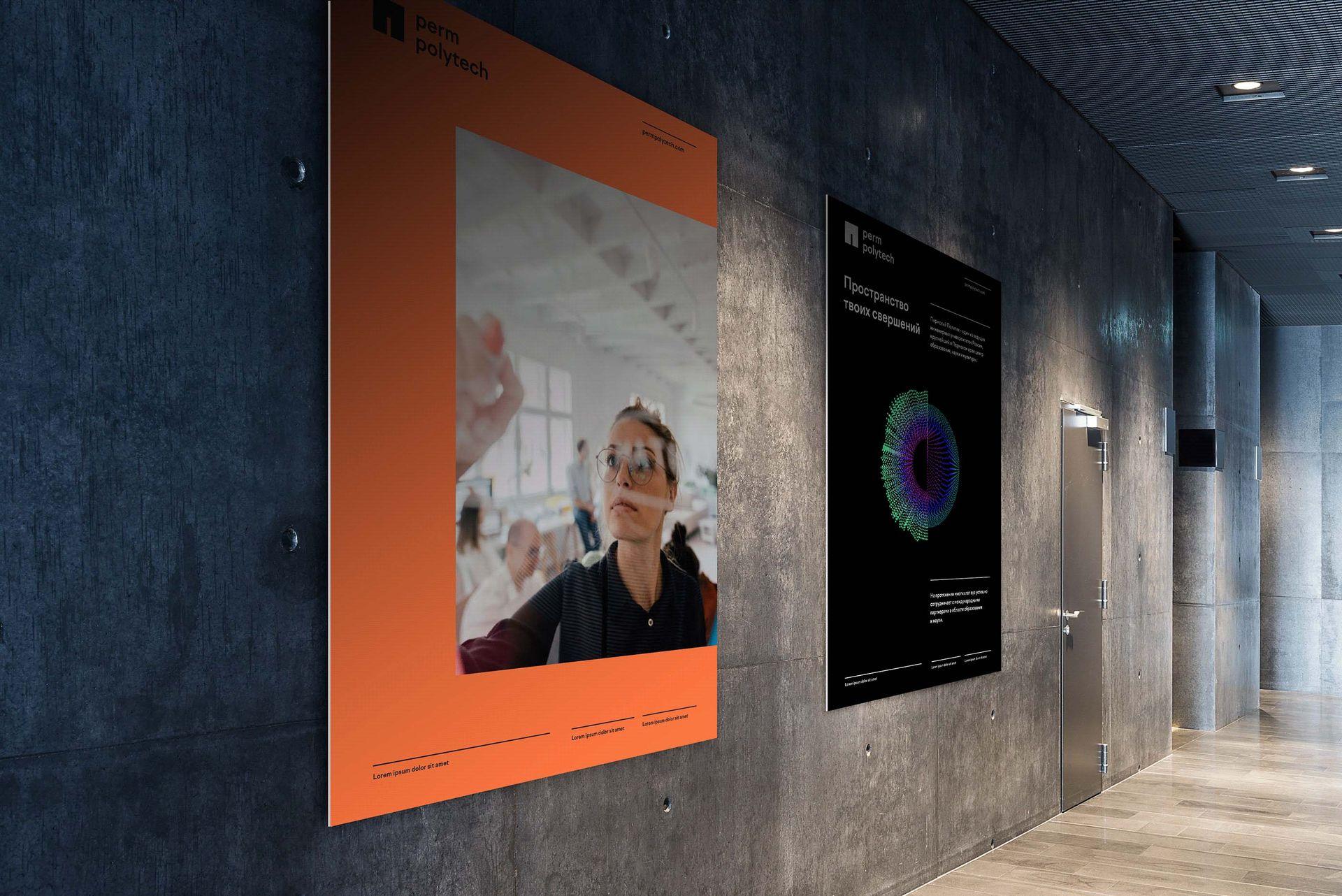
The layout system is based on the brand’s logo (icon) as an expanding 3-sided frame. Combined with a variety of content, it emphasizes the contrast between the regular, hitech external space and the freedom arising from within and expanding into the world. The layout system is complemented with rhythmic horizontal lines that emphasize usterity and structure of the brand’s image.