New York based wellness brand
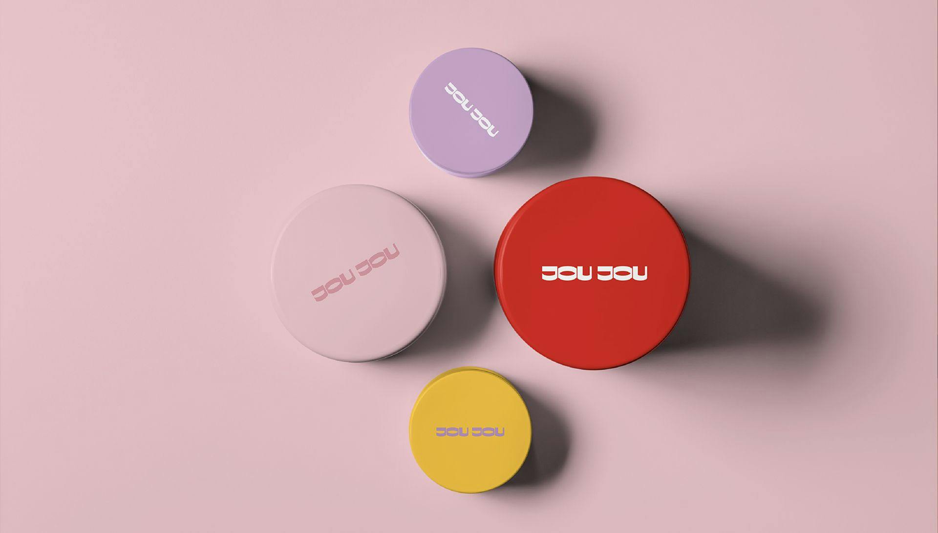
JOU JOU is a Bright, Fresh, and Happy Gen-Z Cosmetics Line. It’s young New York based cosmetics company that creates beauty products for generation Z.
Brand Strategy Brand Name & Slogan Brand Design Packaging Design Brand Guidelines
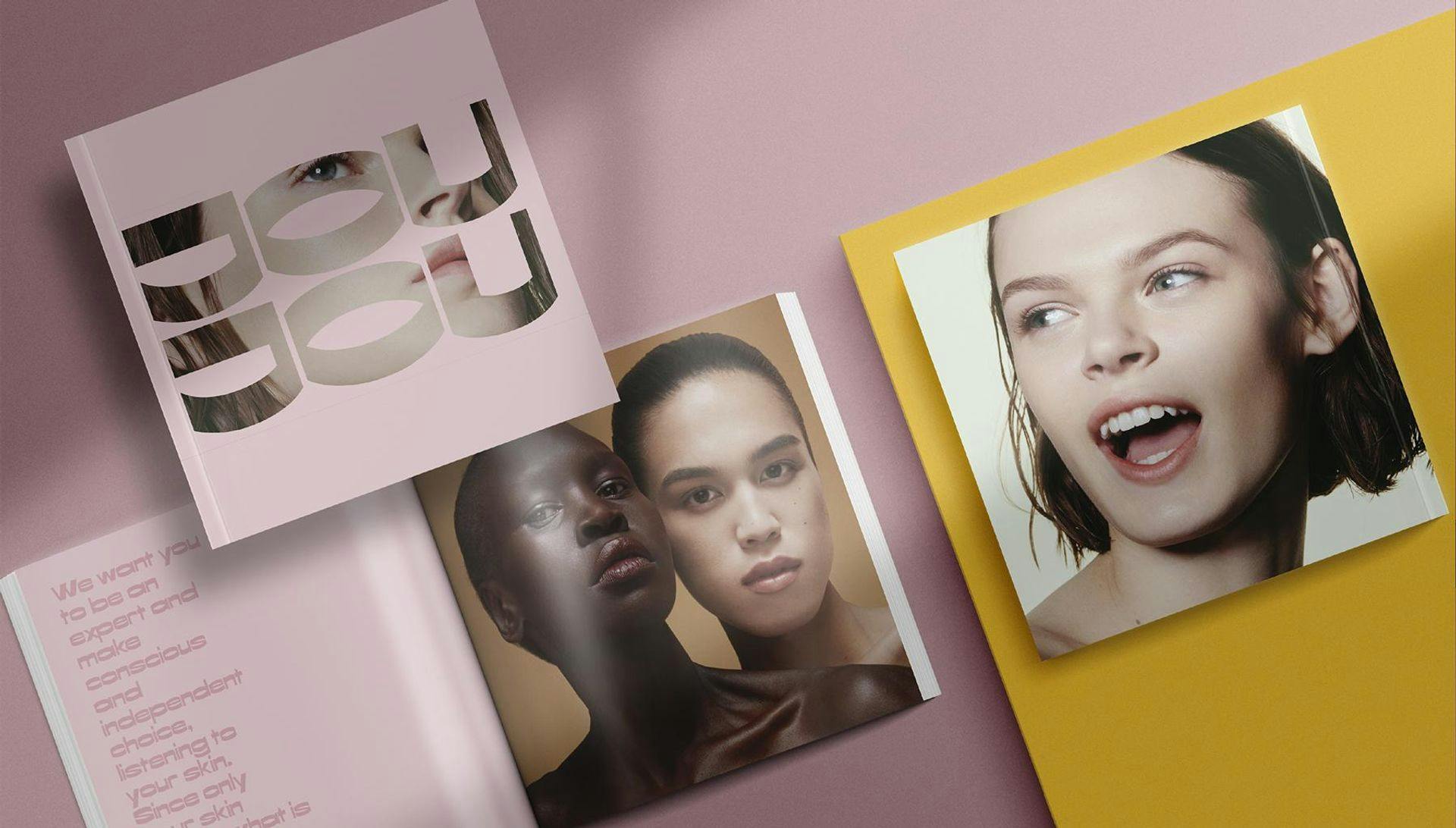
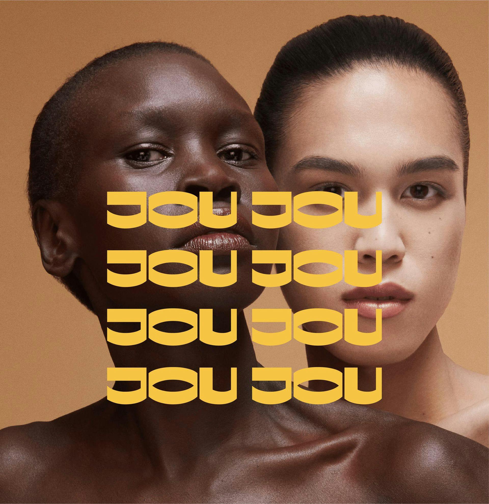
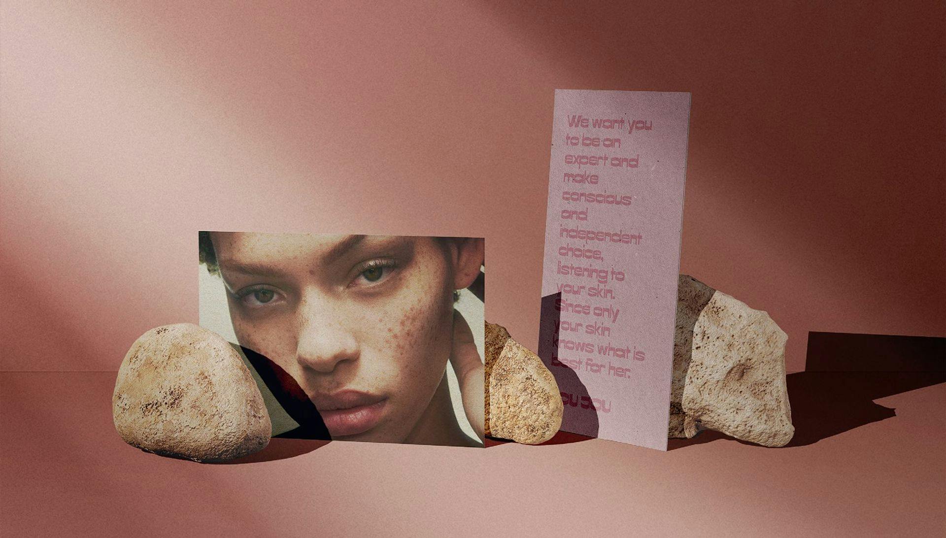
The design language had to be bright, fresh and able to bring happy emotions. The chosen photo style have to represent the targeted audience: diverse group of young women.
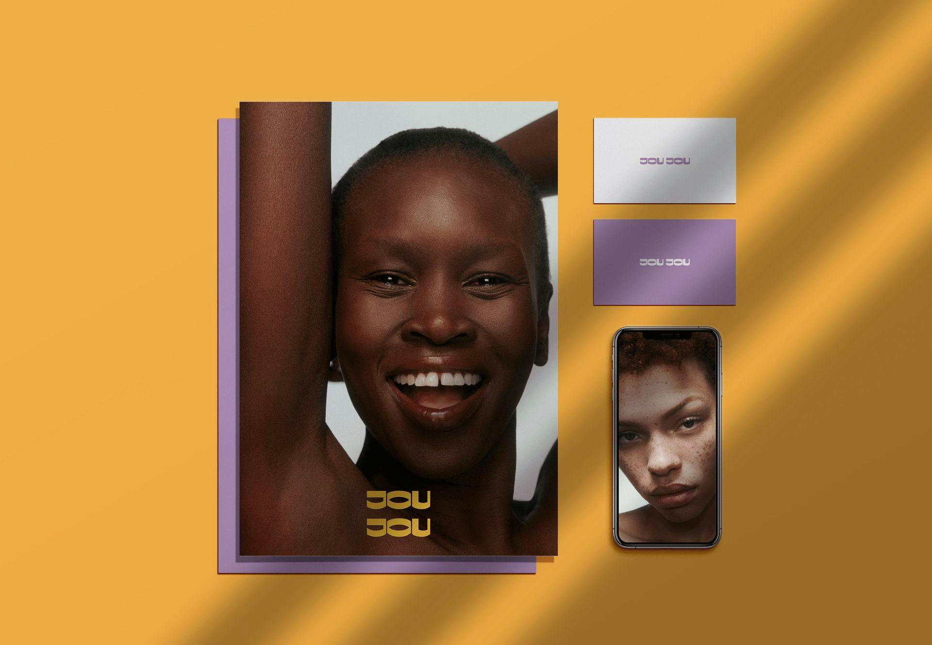
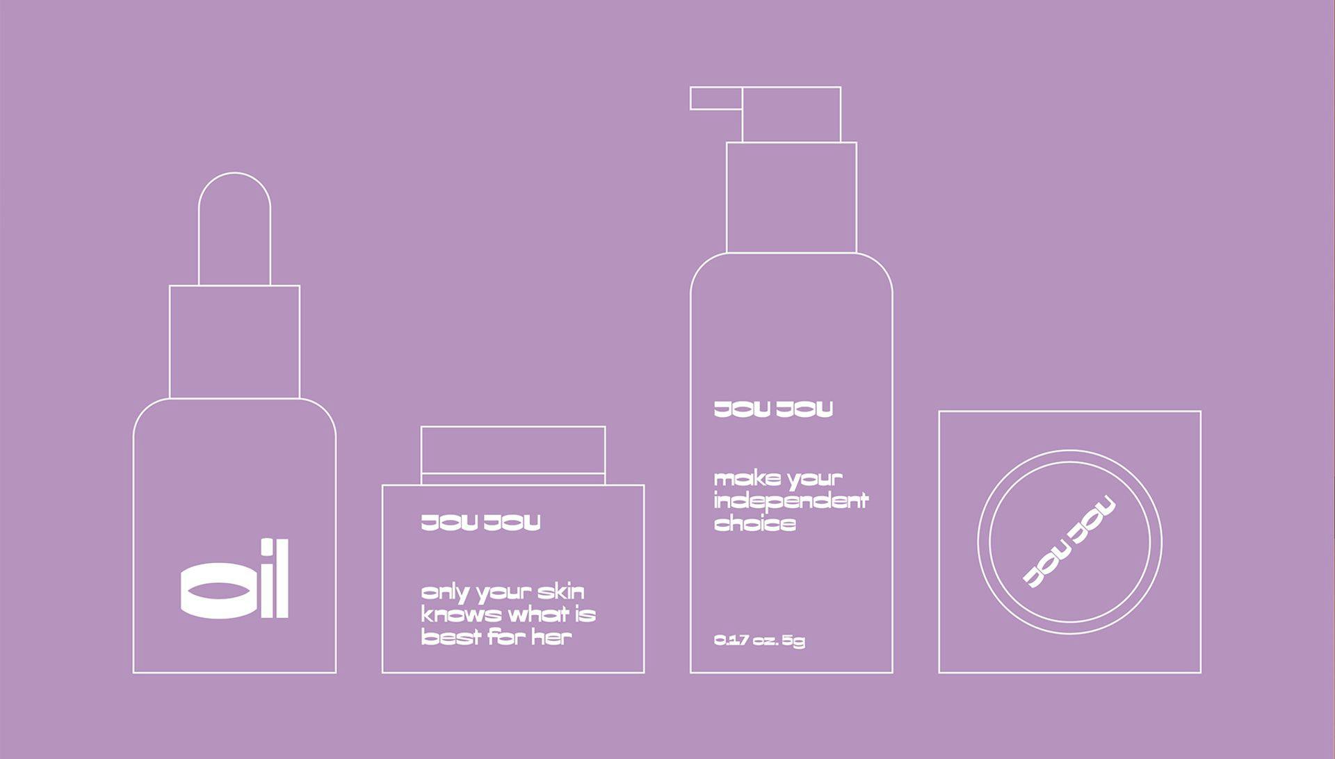
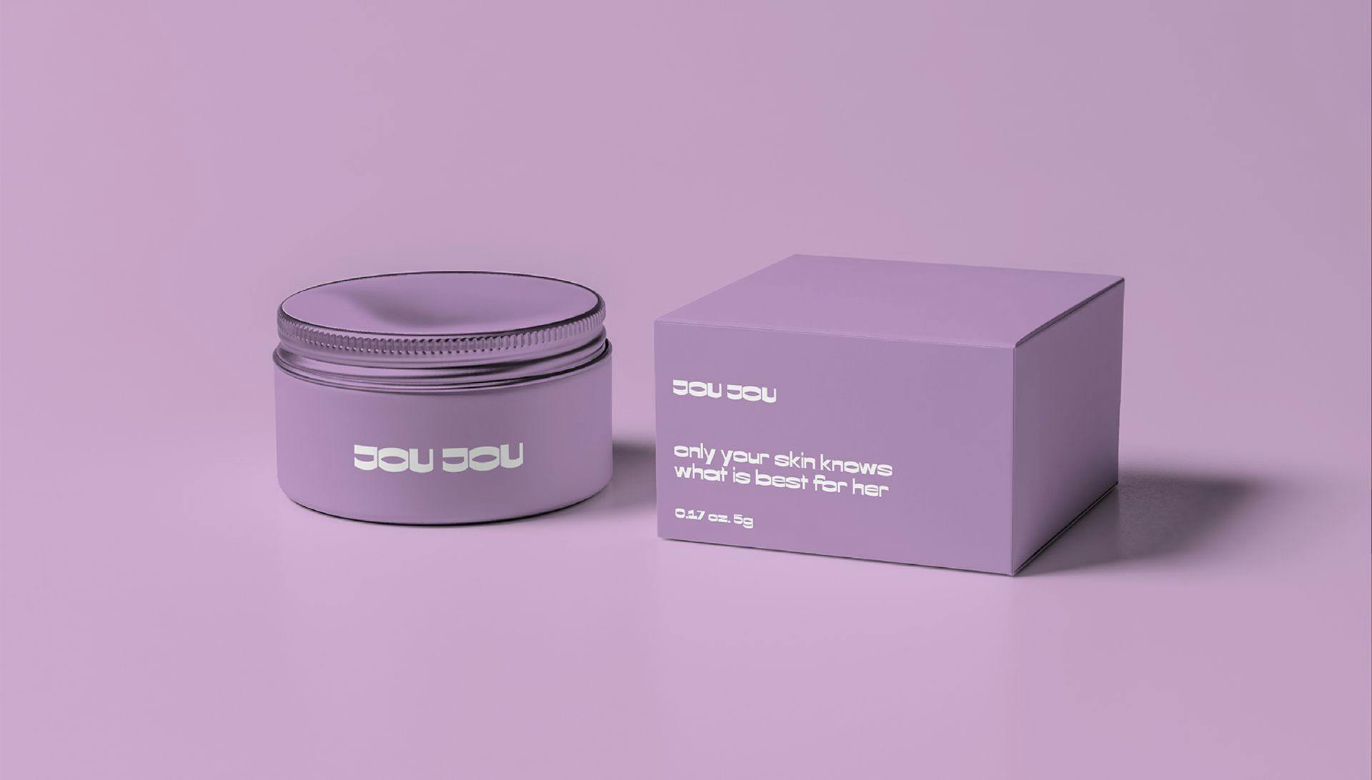
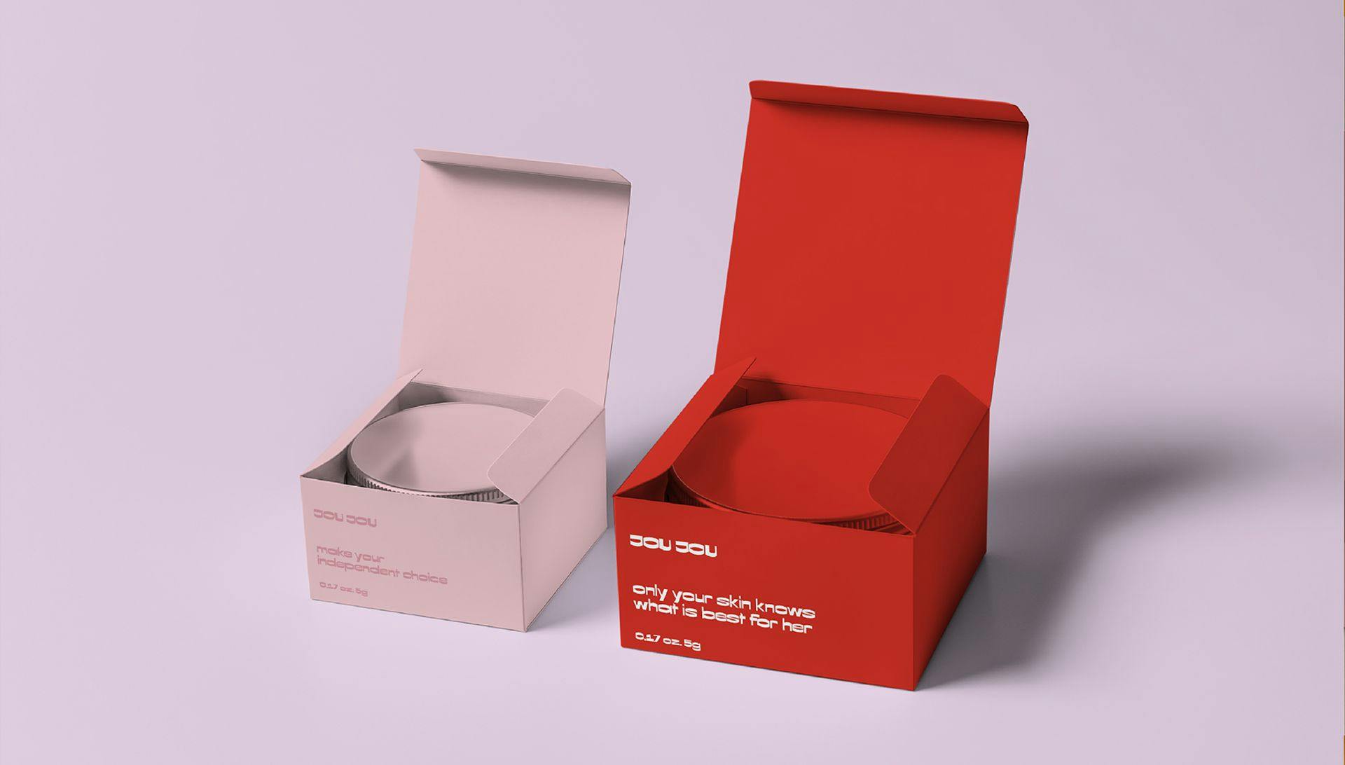
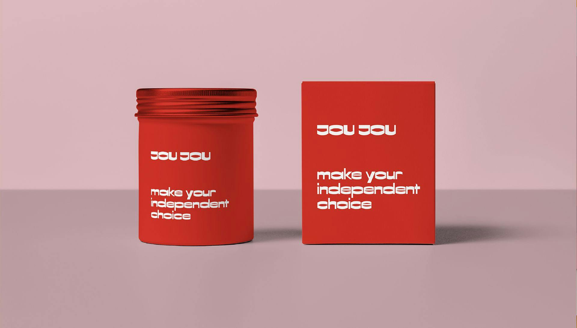
We worked on branding, naming and design for JOU JOU as well as packaging design: tubes, boxes, etc. The communication concept was built around the message "Your skin knows best what's good for Her". We called skin "she" not "it" since we gave a live role to it.
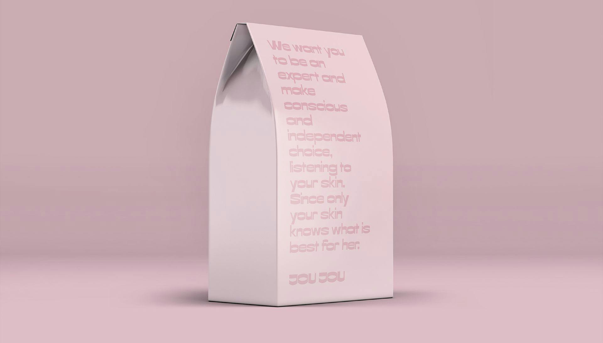
We want you to be the experts and make informed and independent decisions based on what's best for you and your skin.
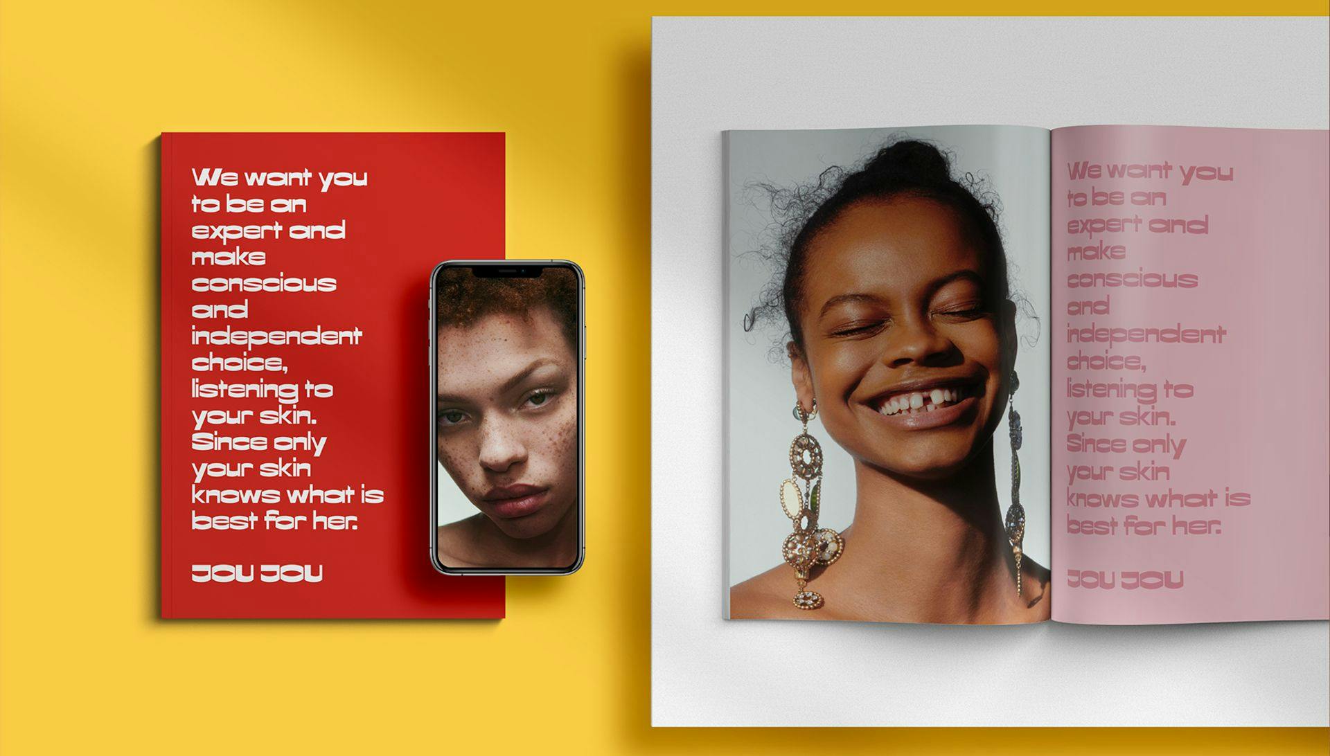
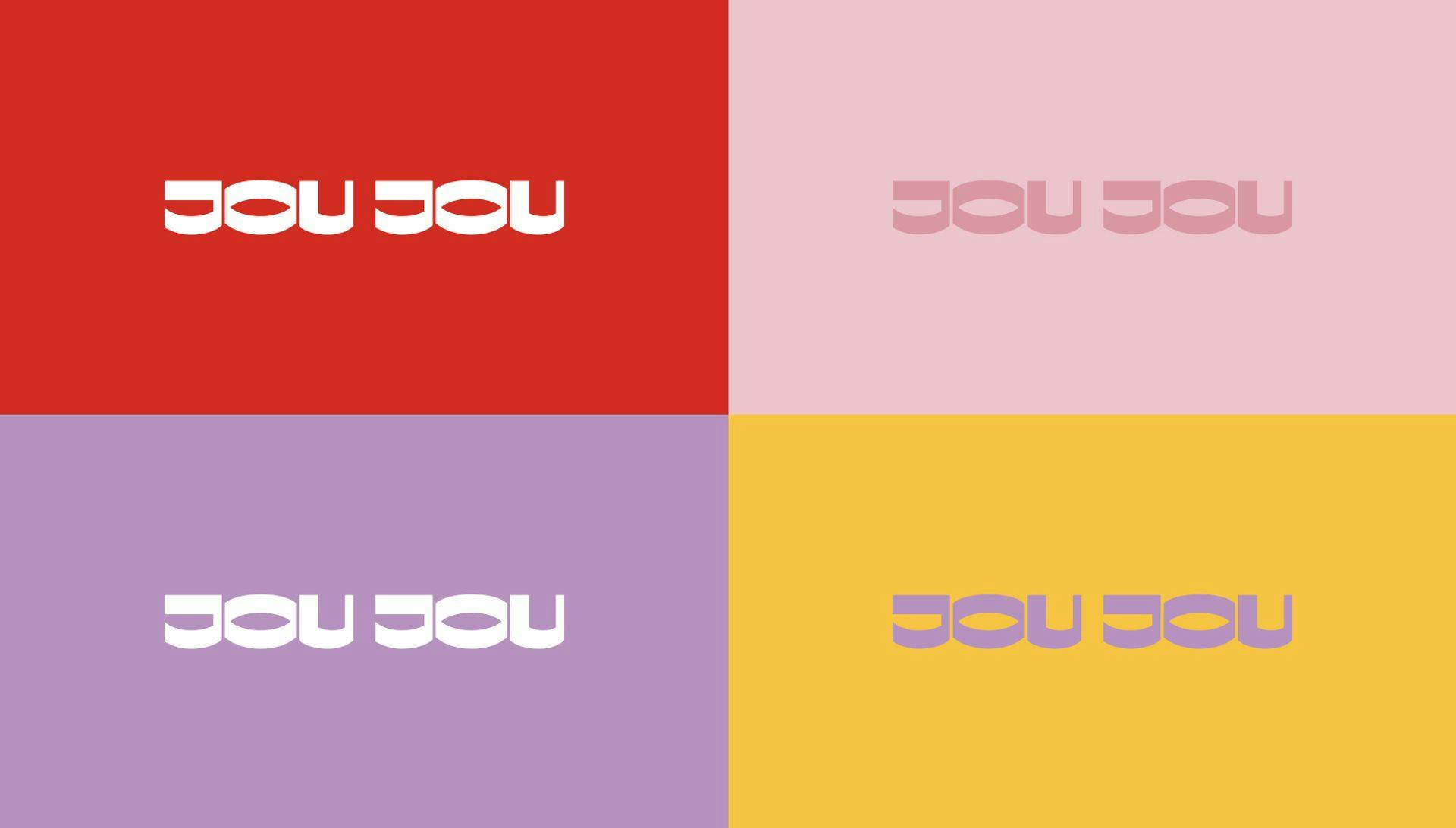
A bright palette of colors is the basis of JOU JOU brand design concept. Each product has its own unique color. A large serif font becomes a design element. Choosing large typography is ideal for both digital and packaging design. The bright, minimalistic style gives brand communications a consistent and eye-catching image.
