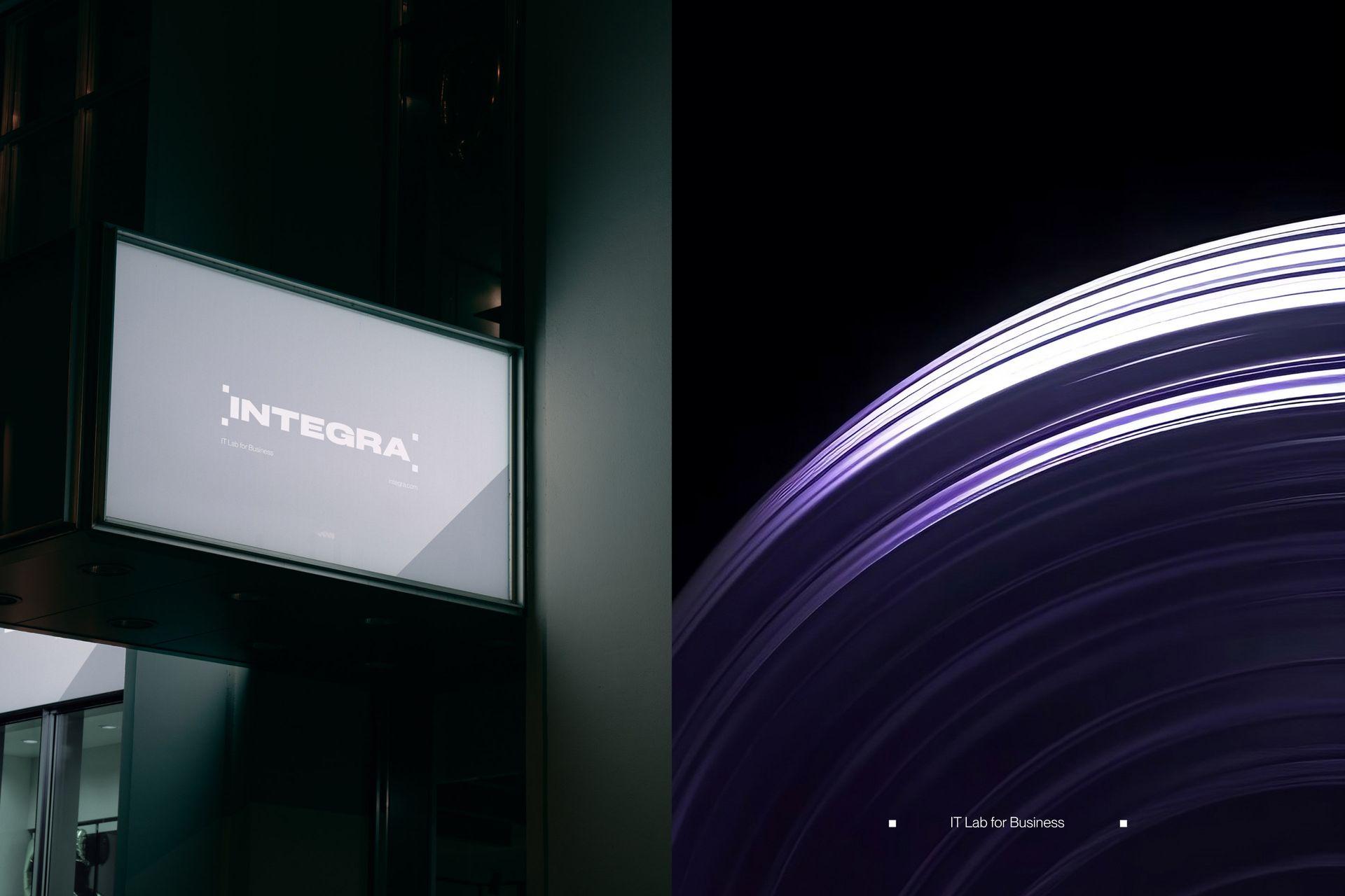
IT Lab for business
Integra operates as a system integrator and software developer, crafting innovative IT solutions and products to enhance the efficiency of its clients' processes. The brand specializes in digitalization across diverse sectors, including production, transport and logistics, agro-industry, metallurgy, fuel energy, and oil and gas production.
Brand Design Brand Guidelines
Our task involved developing a fresh visual identity for the brand, aligning it with the newly established brand platform. Our primary objective was to uphold the company's rich history and extensive experience while mirroring its current strategies and future plans. The design concept is rooted in the core principles of the brand platform, emphasising the analogy between the navigator's role and the hero's role in the realm of crafting digital business solutions.
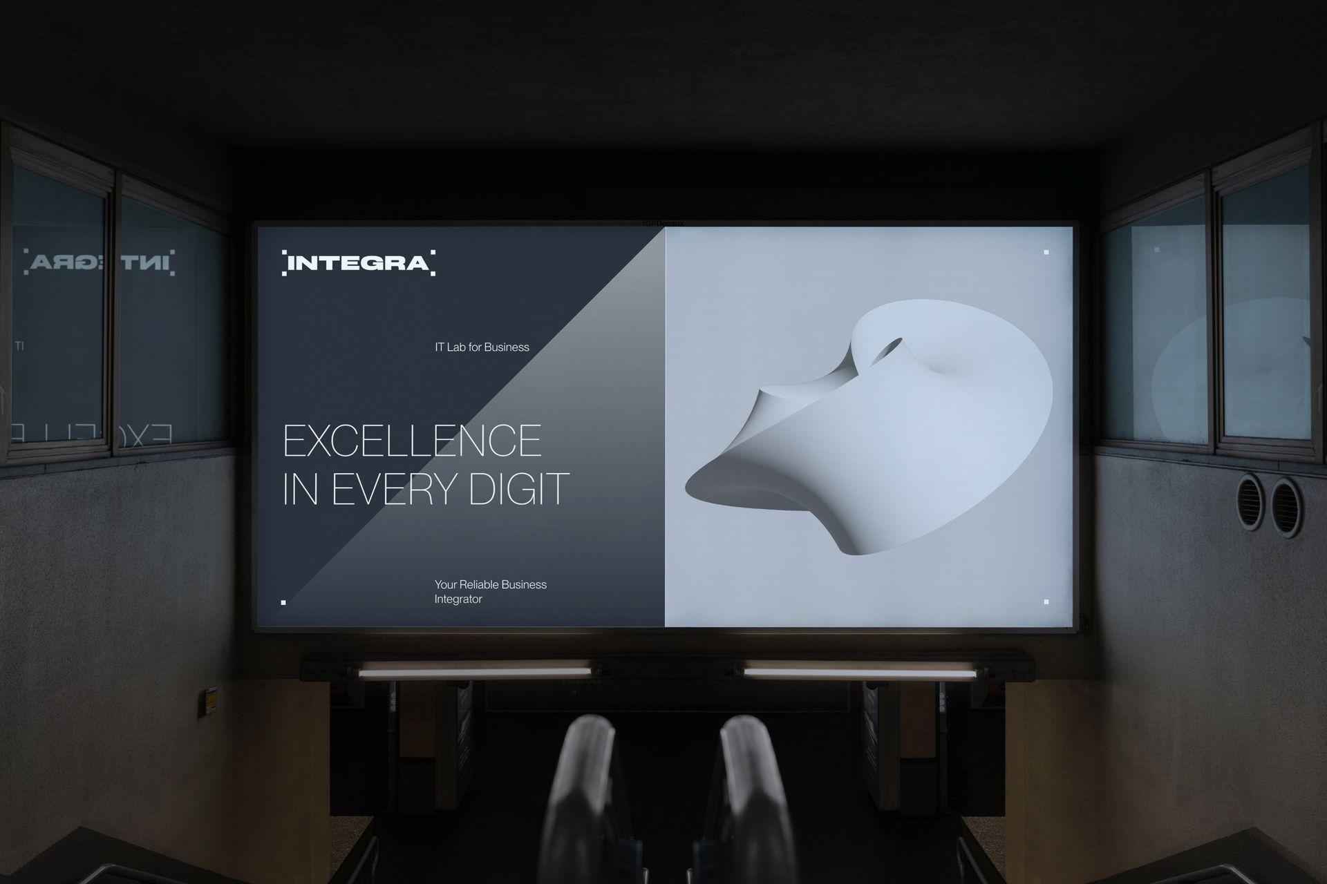
We've created the identity that conveys innovation, professionalism, results orientation, safety, control, and the company's ambitions concisely.
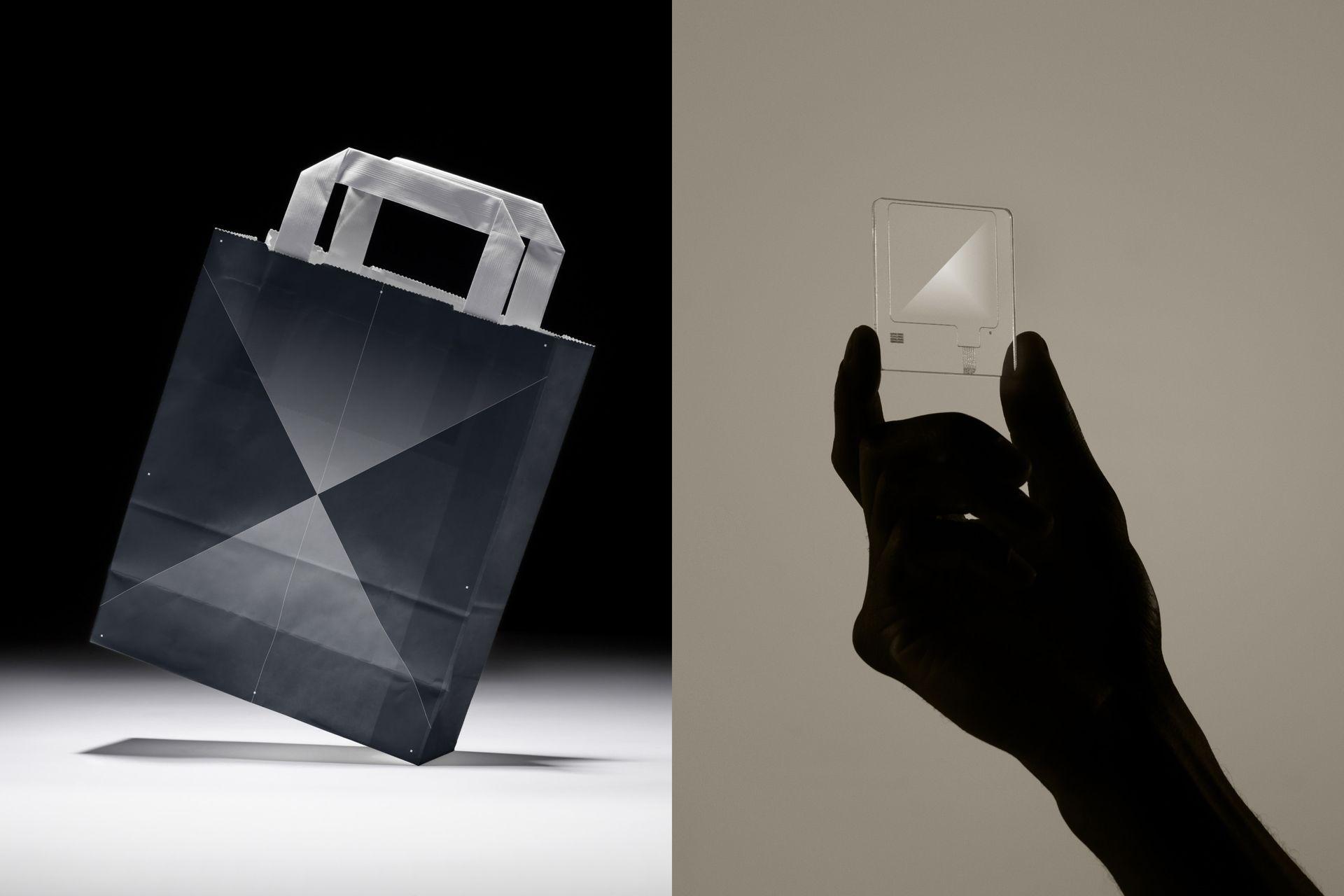
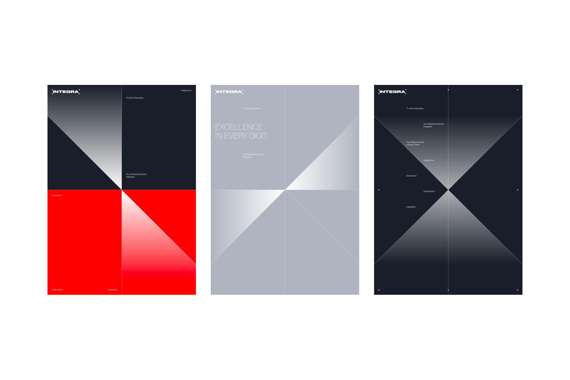
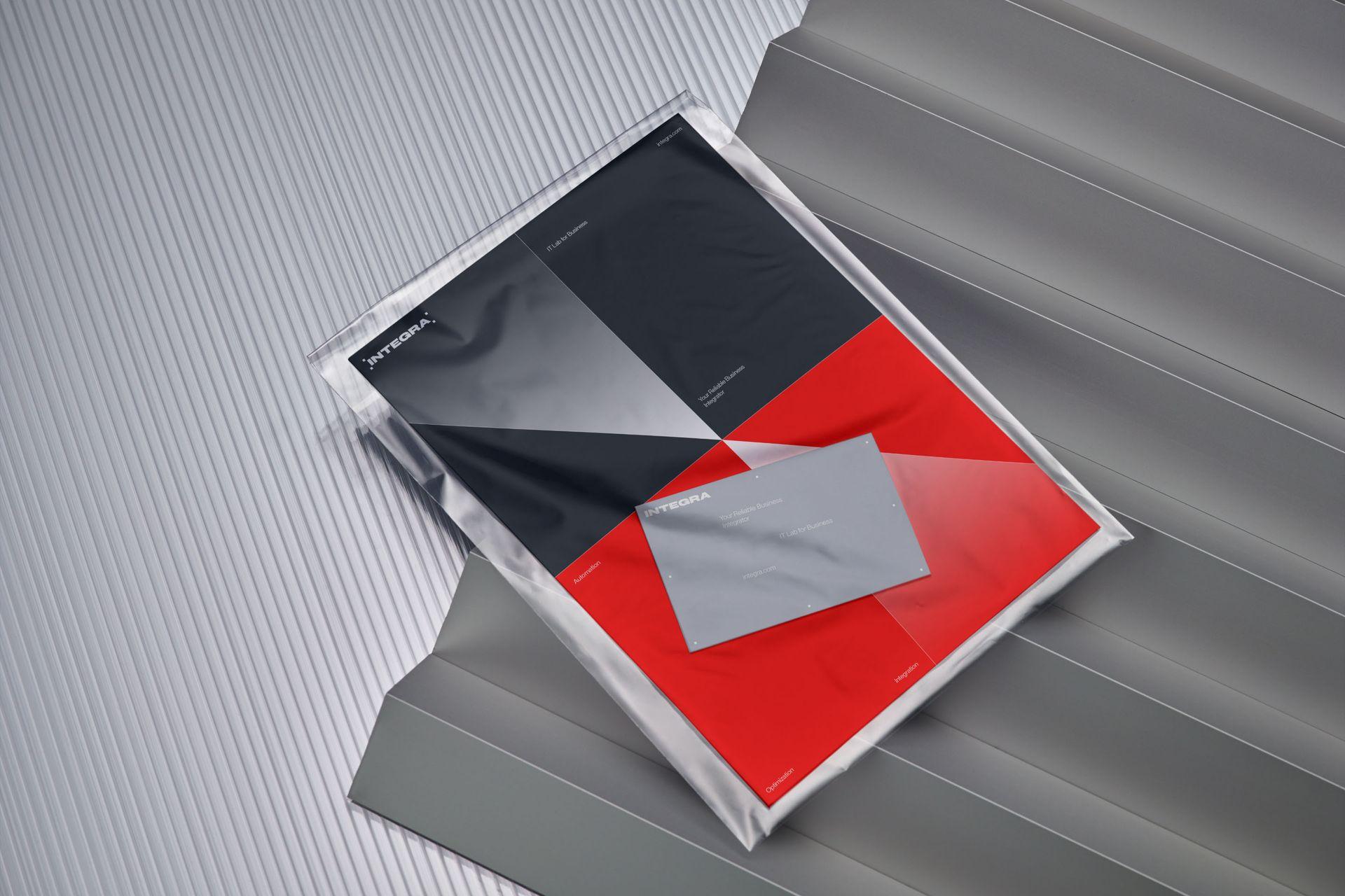
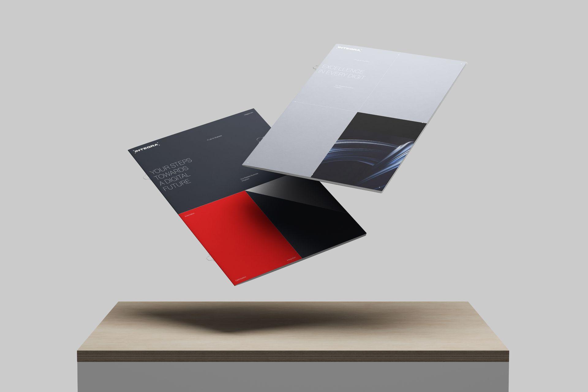
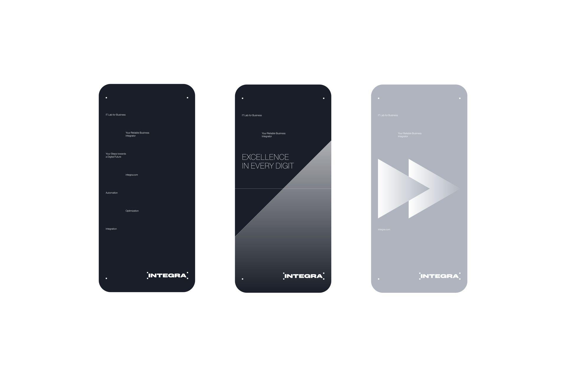
The design concept combines navigation symbolism with digital elements, using large modular blocks to symbolize both physical warehouses and the storage/processing of big data. These elements represent systematization, optimization, order, and control.

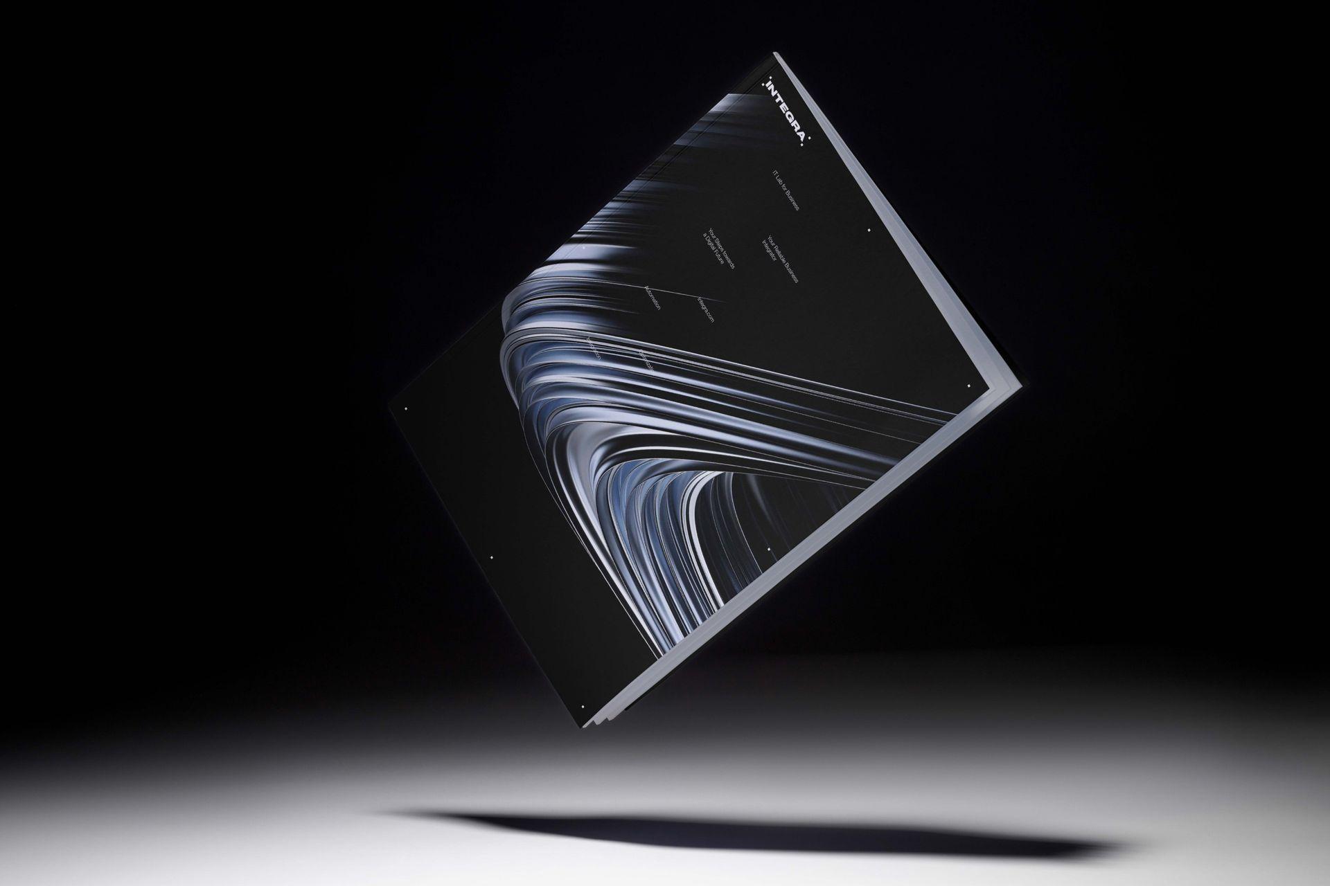
The design element takes the shape of the letter X, where crossed lines, enhanced by a gradient, generate delicate rays. This intersection symbolizes the concept of IT route navigation. The gradient not only adds volume to the lines but also imparts a heightened sense of being at the forefront of progress.
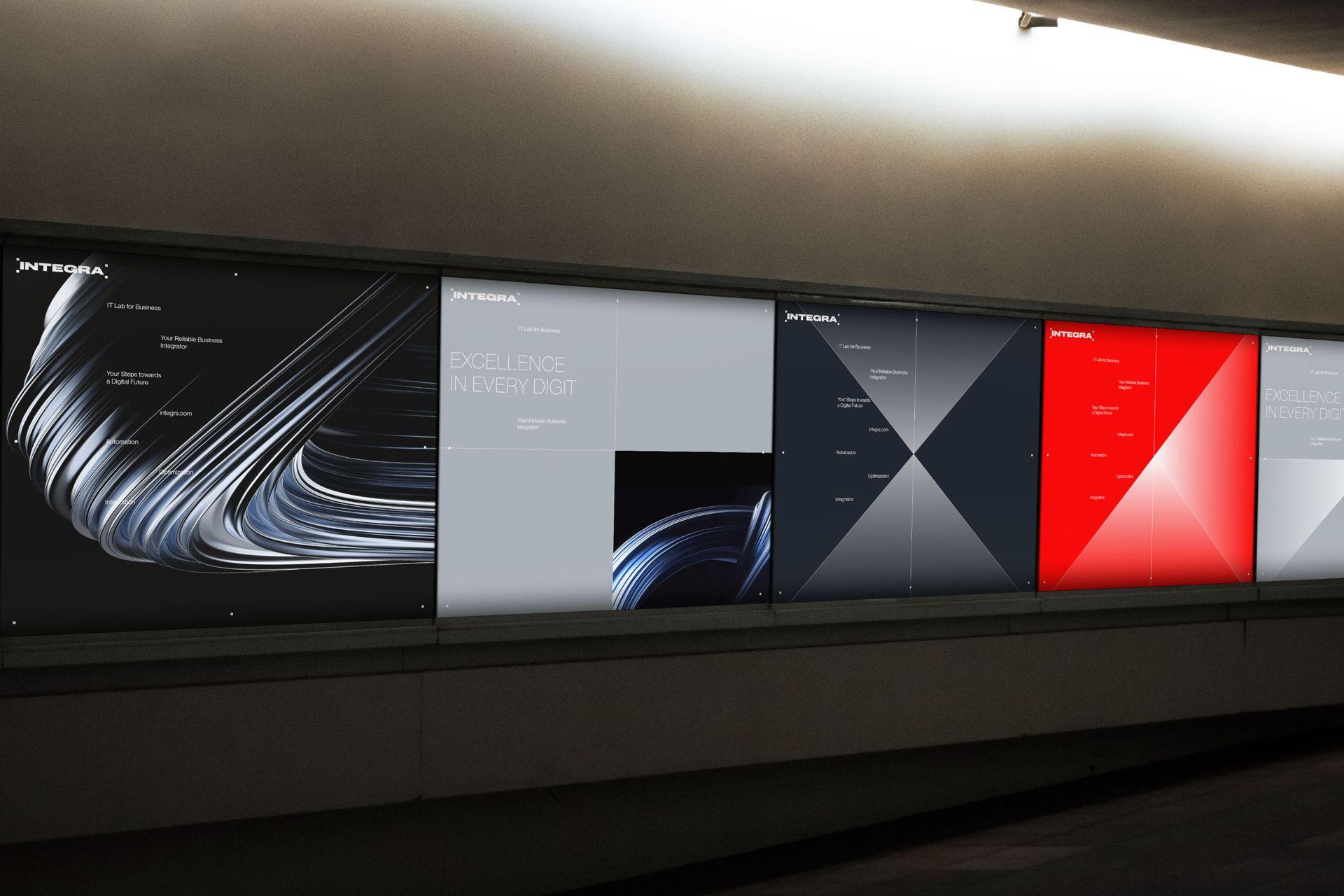
The design system clearly communicates values and brand positioning with a bright, bold, and concise style. It signifies innovation and leadership, showcasing a willingness to lead the industry.