Nature of the cleaning systems
Since 2003 Everest Elektromekanik has been designing and producing innovative industrial cleaning systems offering the 360° engineering service.
Brand Design Packaging Design Brand Guidelines

To redefine a brand that was founded 20 years ago and create its new unique identity, which will reflect the new brand strategy while preserving the brand's traditions and DNA.

Inspired by the nature, we have created a design concept that combines the allegory of purity and minimalism: streamlined shapes, crystal clear water, steel shades, and the idea of the cyclical stages of cleaning.

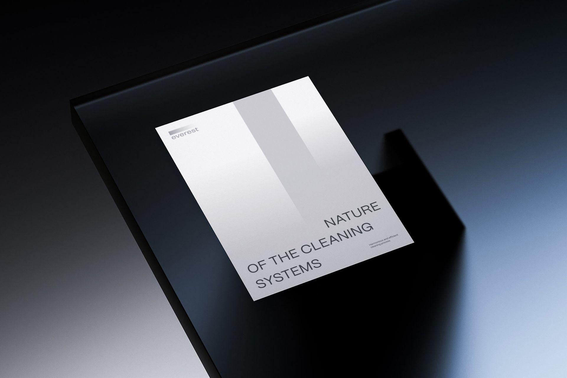
The new identity embodies elegant and modern aesthetics, featuring straight lines, geometric shapes, and a minimalist color palette. In addition, the design includes a series of interconnected lines and blocks representing various stages of cleaning.


The gradient stripe in the logo symbolizes the flow of water. It evokes a sense of depth and movement, emphasizing the fluidity of the cleaning process. The stainless steel-inspired metallic hues convey to the logo a touch of sleekness and modernity.

The color palette consists of cool tones like stainless steel and shades of blue, which helps to blend the concepts of nature and technology.

A series of interconnected blocks representing various stages of purification. Each block have a different level of transparency, symbolizing levels of purification achieved at each stage. It is essential to have a lot of space and air in the layout system. Blocks of text are always written with a large indentation. The gradient is structured in blocks, resembling rhythm of cleaning stages.


